|
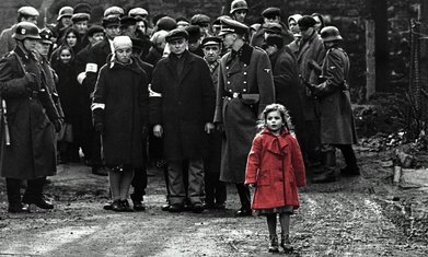
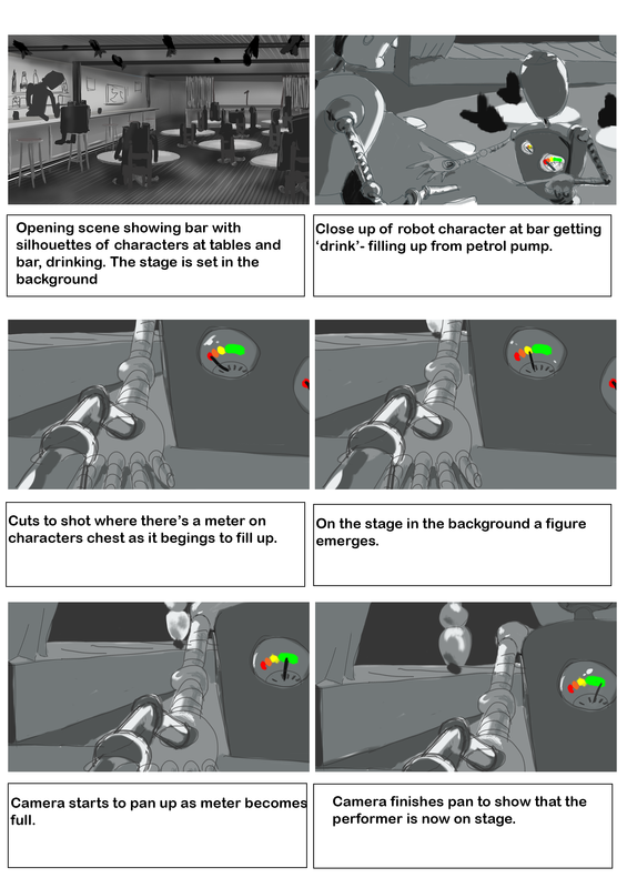
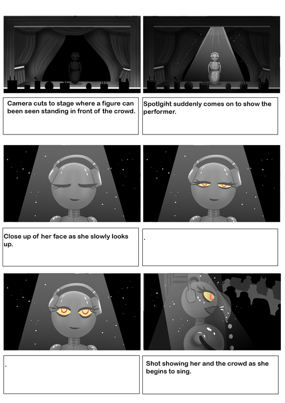
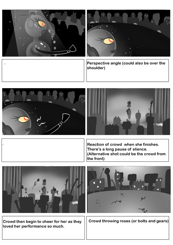
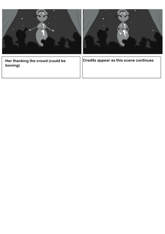
Below is our final animation that we presented! Presentation to go with animation We liked how our animation looked black and white and drew inspiration from a shot in Schindler's List (1993). We also had to change a few of our shots so that the animation fitted together better. There where a lot of shots and camera movements we all worked on but a lot of them didn't make the cut as we had to use the best ones. Dermott and Ryan worked a lot on getting the right angles and editing it together.
FeedbackI'm pretty pleased with the outcome of our animation and we received pretty good feedback. Our main criticisms where:
We had previously been told about building up tension so we had already taken this into consideration. With the time limit on the animation, it was understandable that this was the best outcome we could work with as we already did several attempts to see how it would play out. Below is the updated animation based off the feedback
0 Comments
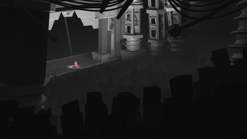
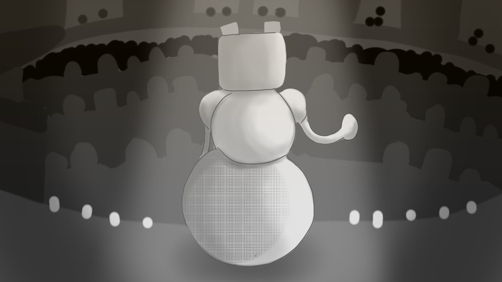
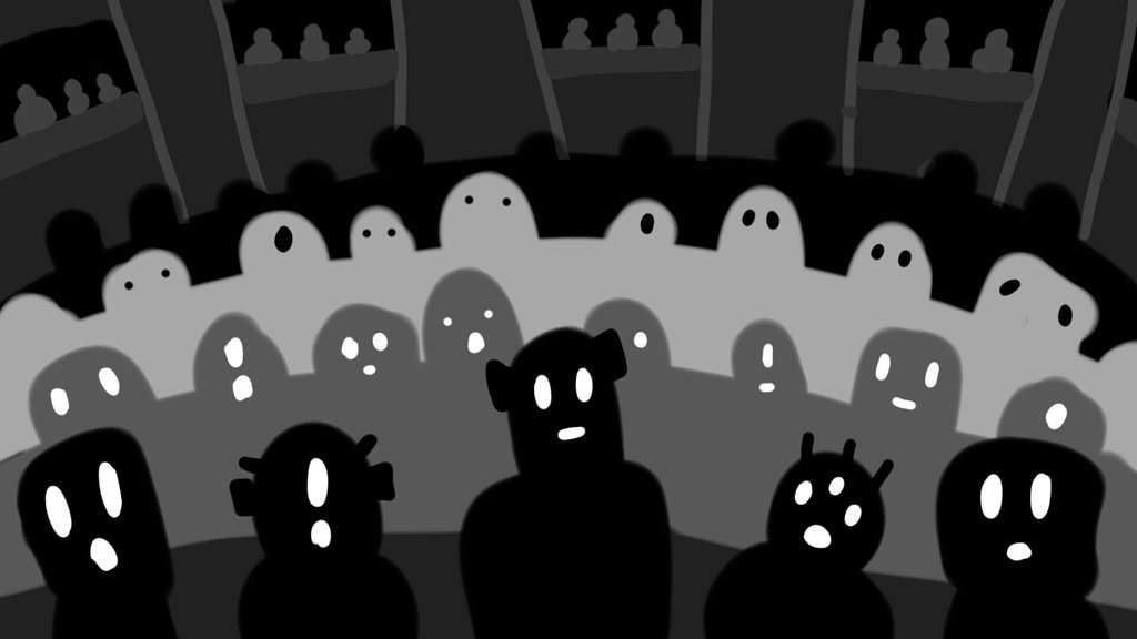
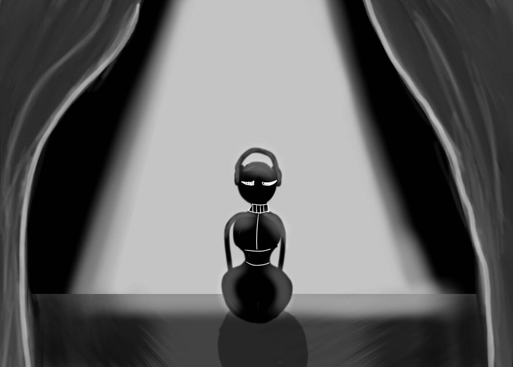
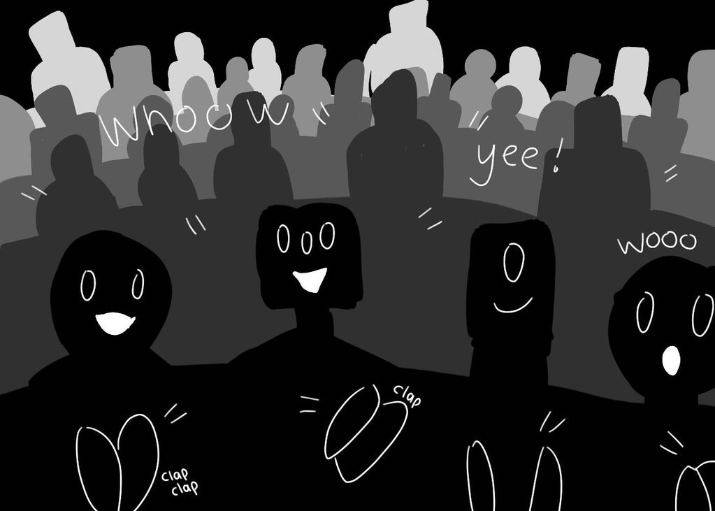
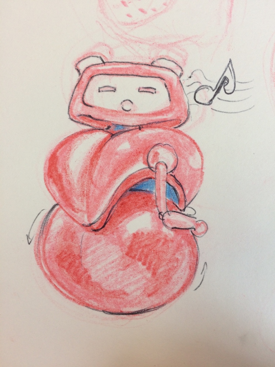
Testing shots and model movements to make sure they're ready to render. (The tests in video below are Maya Hardware renders just to see how everything is moving) I animated some of the reaction shots for the characters- the ones where they are shocked and waiting for the performer to come on stage. Also doing some tests for how the intro should be, whether it fades in.. not sure how it should look yet. I was also reading this document Applying Principles Of Animation To Robots which talks about good ways to apply the 12 principles of animation to robot characters. It talks a lot about how they show how they're feeling, they're robots so they don't behave the same as humans, but the emotions can still be put across through expressions and movements. I tried to use a few of these tips for the facial expressions and small arm movements. The image below is just experimenting with a bunch of fonts on a black screen and on top of our opening scene to see if any of them look good. We where going along the lines of 'The Great Madam Modem' for the name of our animation, so that's what we have for now unless we change it later on. 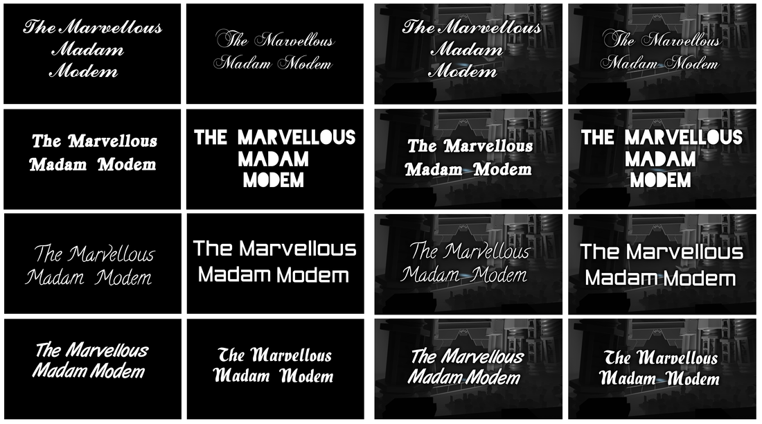 We are also trying to be more consistent with our camera angles and how many cuts we make. In our animatic there where a lot of different views of the performer and the audience.. we need to make sure our camera isn't jumping all over the place. Below is the camera angle we are using for the character reaction scenes- We need a close-up shot so it focuses on the characters expressions. We'll add depth of field to the camera so the background is slightly blurred out. We also decided to keep everything black and white expect for the body of the performer which is red so she stands out compared to the other robots 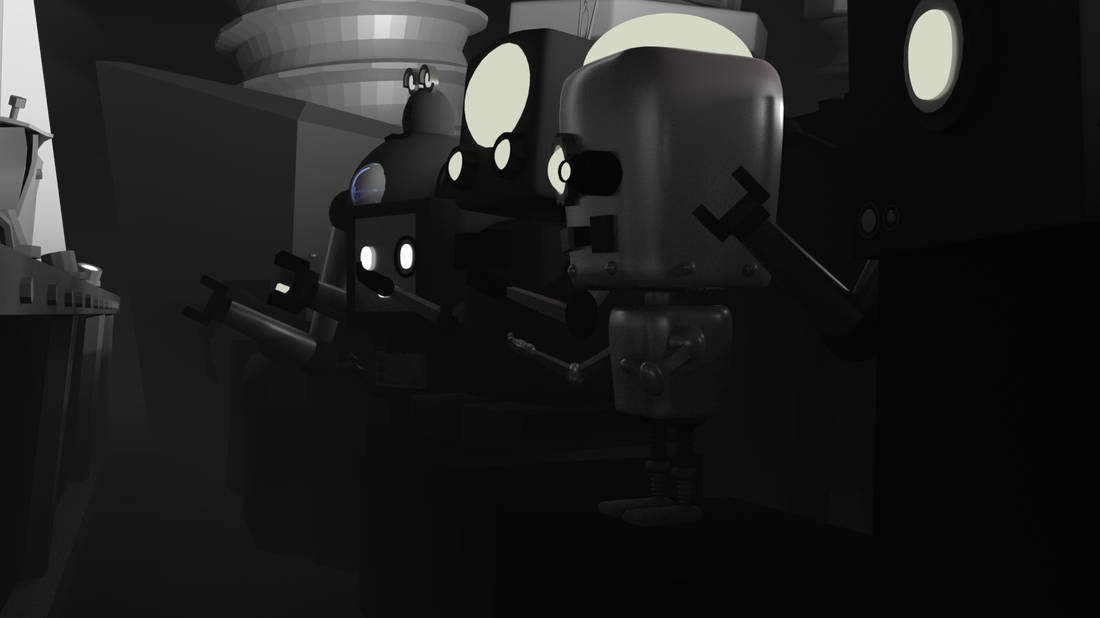 Set up by Ruxandra
We've started putting together our models and ideas so that we can begin rigging and actually assembling the animation! 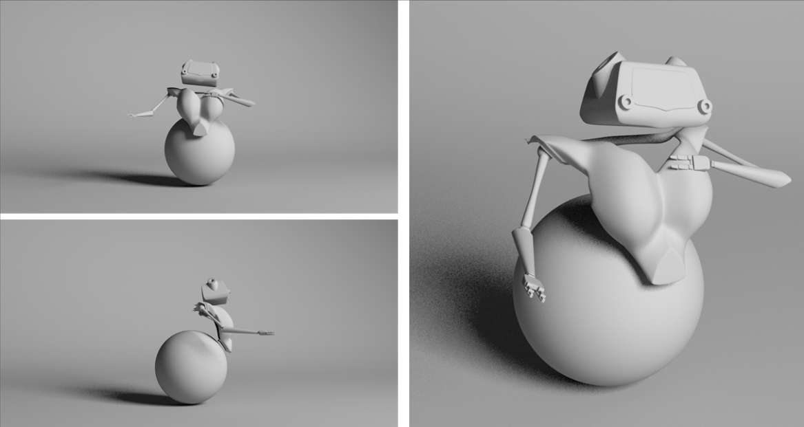 WIP of main singer (model by Ryan) 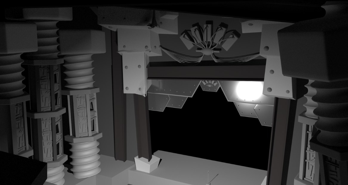 WIP of opera house and stage (model by Dermott) We where also looking at what kind of colours should be used and did a few quick examples to see how each of them looked. 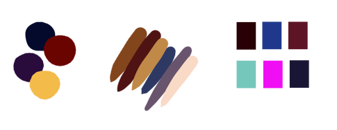 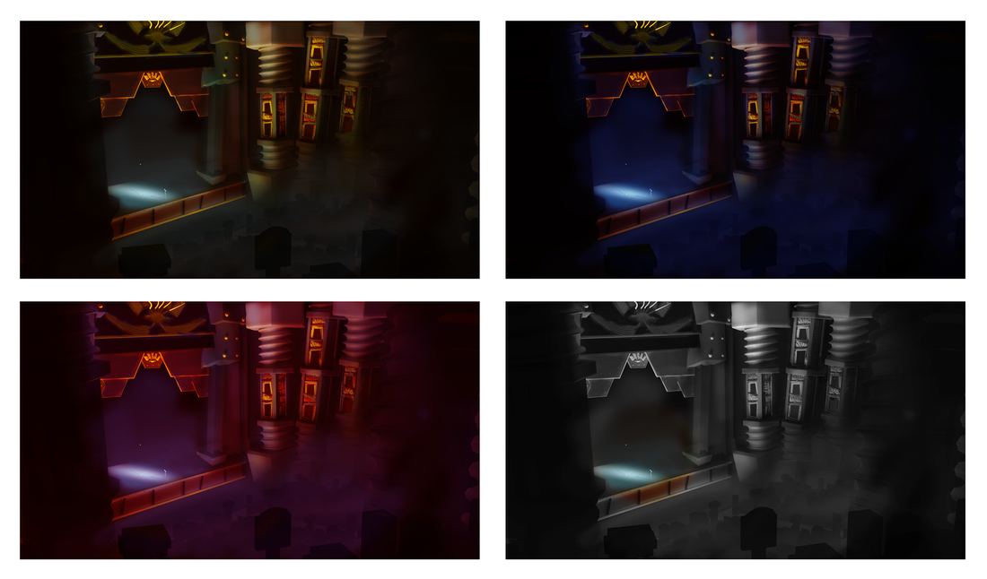
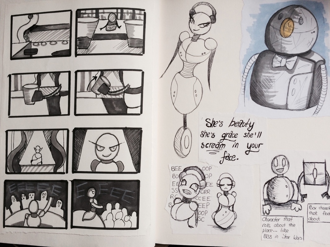
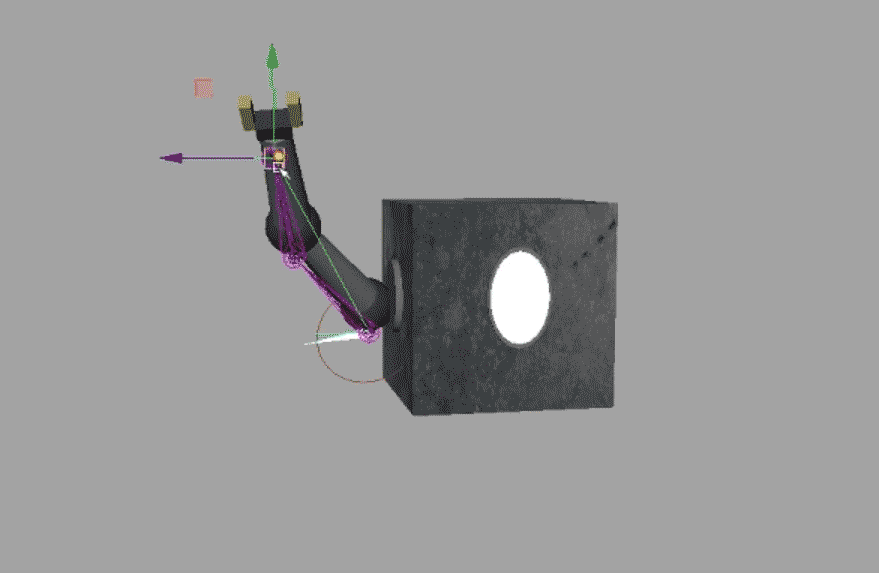
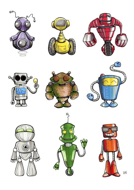
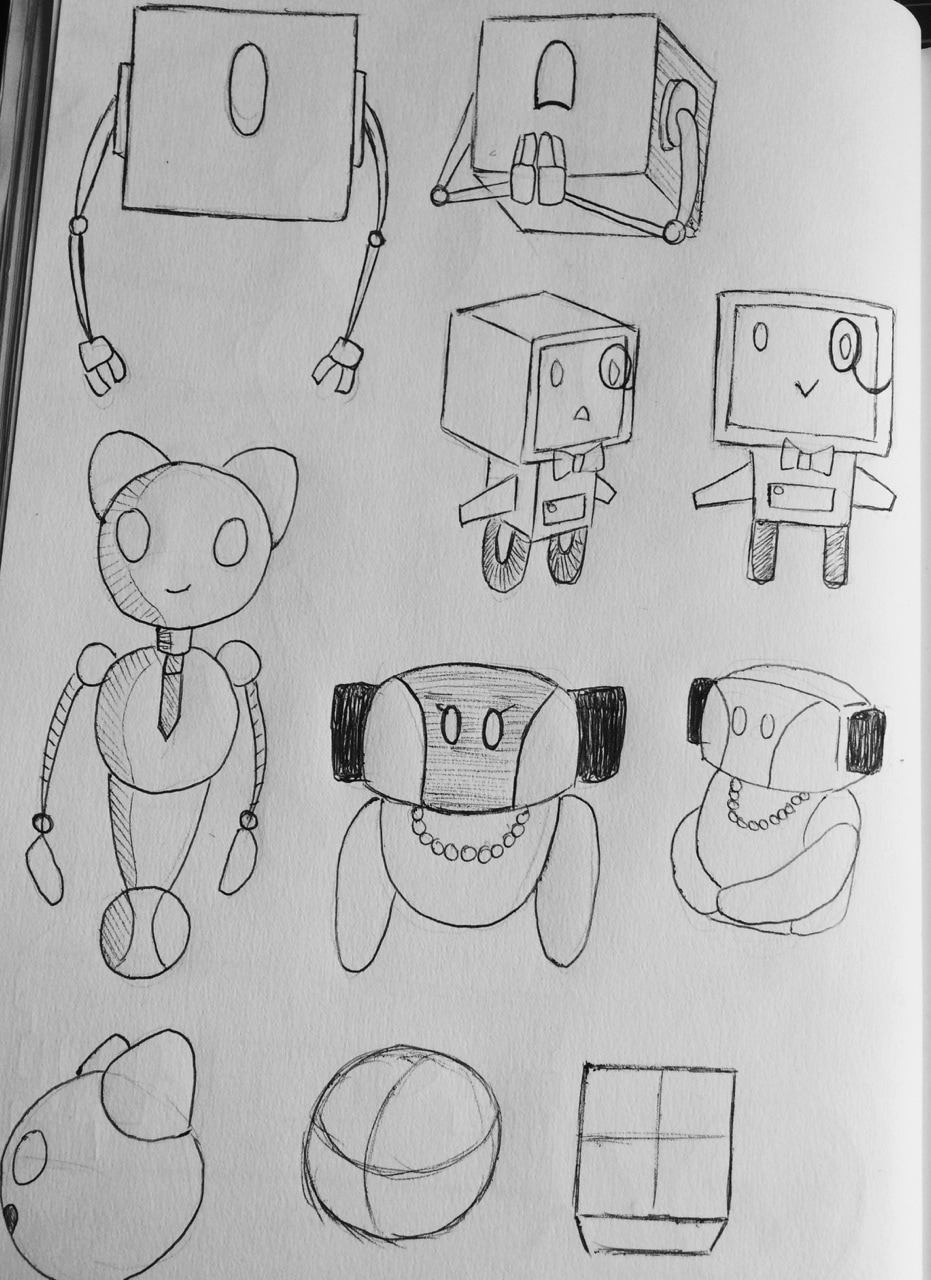
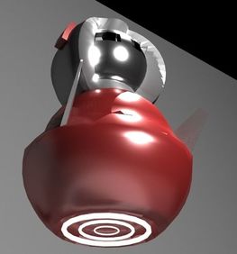
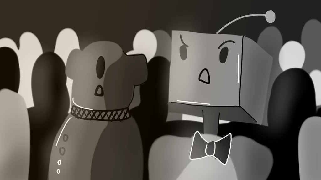
 I wanted to give my characters cute beady eyes that glow in the dark.. like a computer screen. But I wanted them to be able to move in lots of different shapes so I can get whatever expressions I need for my characters. So I made a pretty crazy rig for the eyes using lots of controls- basically with this I can make the eye any shape I want, I can also set attributes for the rig so I have settings for different emotions which I can just turn on and off. This saves me having to re rig the shape of the eye for all the characters. I also used the same rig set up for the mouth (for any characters that have mouths) because I can just change the shape to look like a mouth rather than an eye. (You can see rig below, it looks a like hectic with but it's actually super simple and handy to use!) 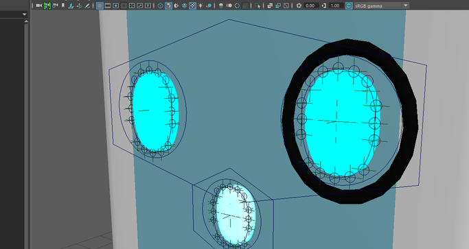 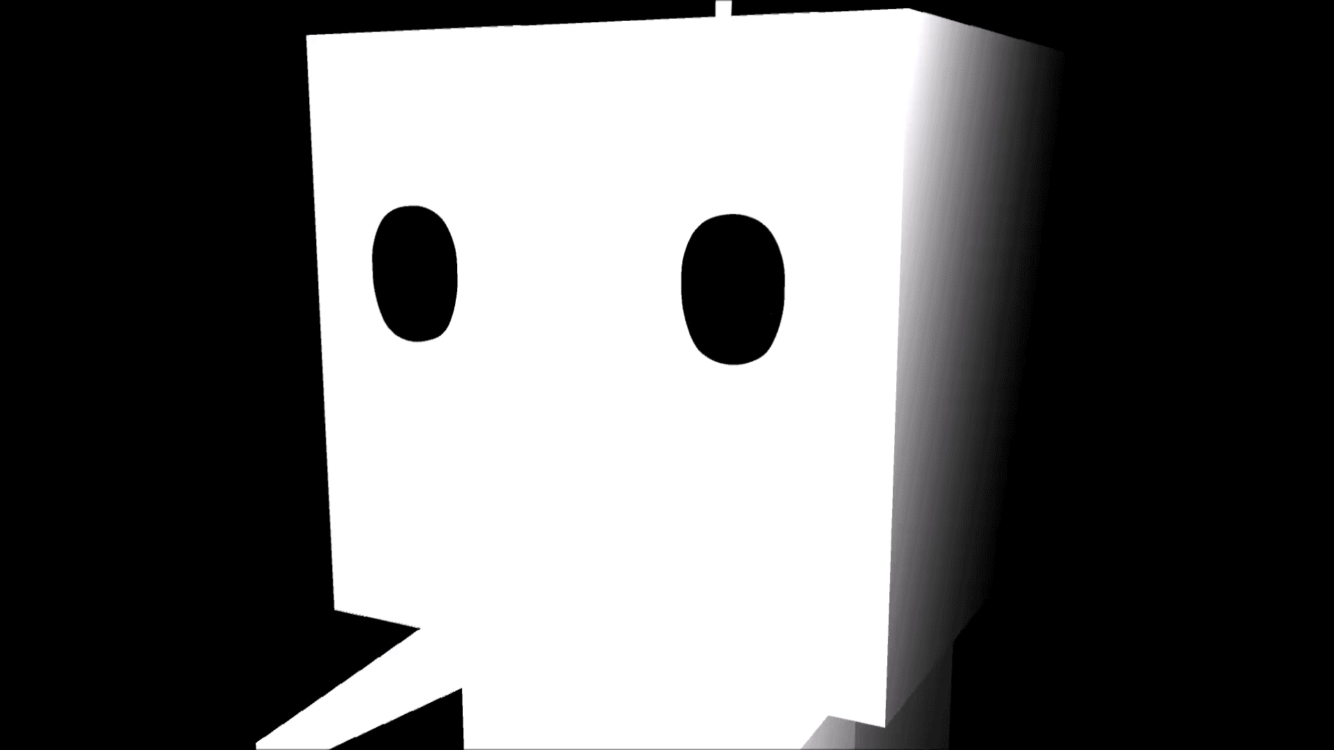 Testing the eye rig 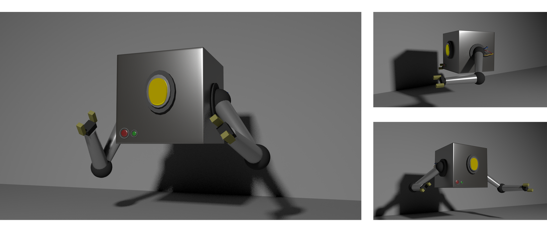 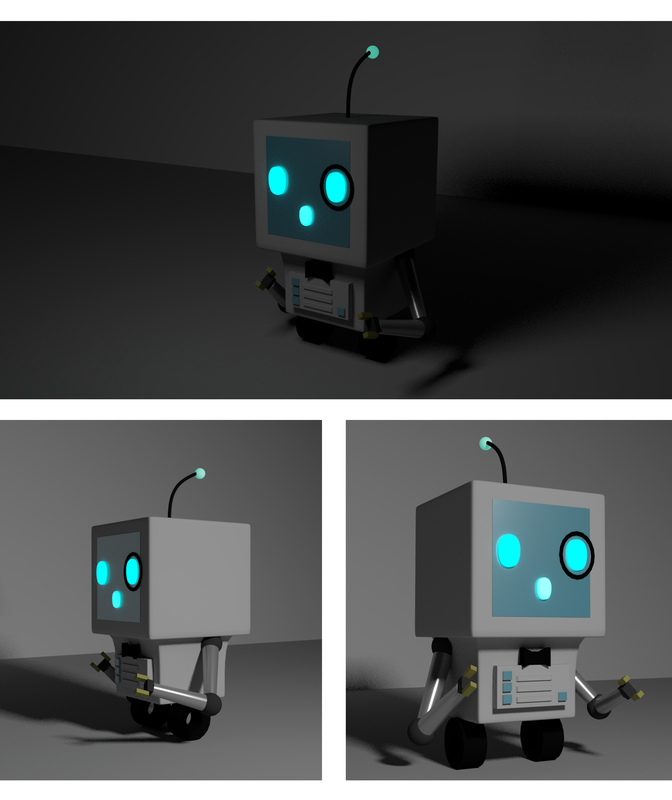 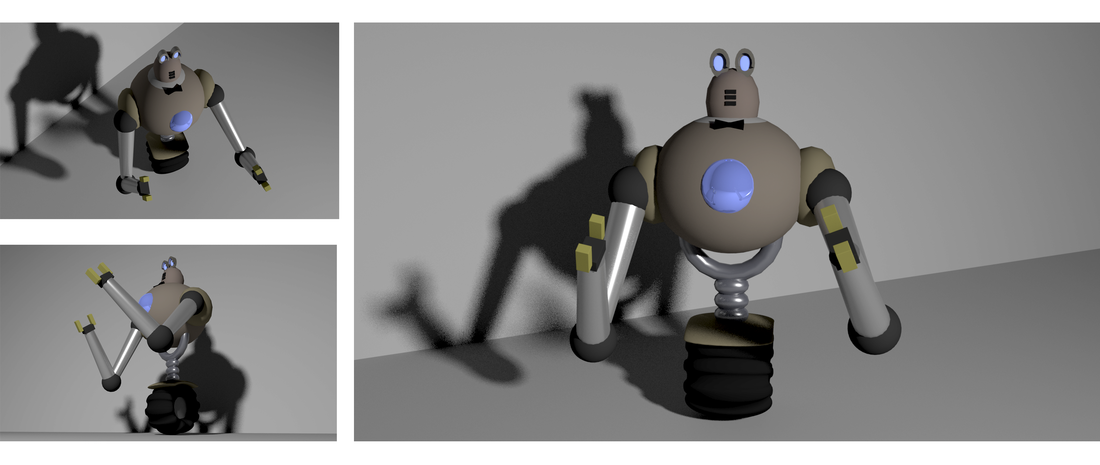 I was looking into the idea behind our story more and what the meaning of it is supposed to be. Although we are going for a comedy type animation we still have a meaning behind it- possibly to do with nostalgia. The younger generation today won't remember or even know what an old modem is or will have heard of the dial up noise (or where it comes from anyway). Also the singing style of opera is usually unpopular among younger people or can just be unpleasant sounding to people. People who tend to understand the art form understand it a lot better and enjoy it. I was also looking at the importance of communication and why people like listen to songs/music. Basically communication enables us to better understand and connect with people around us. music can make people feel good or change their mood and people sometimes are able to bond through music. 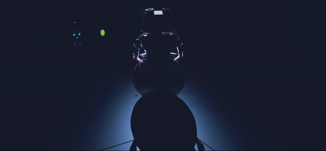 Then i went on to look a bit a modems and how they actually work and what they do (considering our main character is based off one) Modems encode or decode digital information for transmission- sends out signals. It's means of communication. So, In the world our characters live everyone is a robot. These robots communicate through digital frequencies and signals (or 1's and 0's). So although the screeching noise, to anything that's not a robot, would sound terrible, to the robots it sounds beautiful because they are able to understand it. Taking my research into considering I thought it would be a good idea to base our implicit meaning on communication. The implicit meaning behind the story: Importance of understanding a culture (or other languages) gives you a more positive attitude and less prejudice toward people who are different or do different things- understanding enables you to experience and enjoy different things. Below are designs I was looking at for inspiration. Just cute and goofy little characters..I'm all about the cute floating ones.
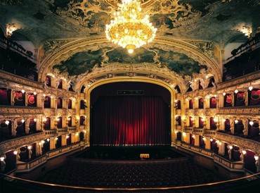
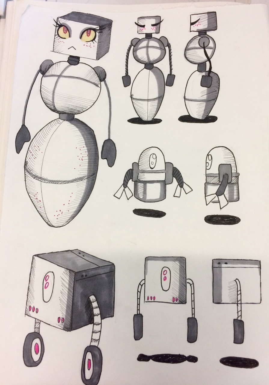
Above are some more character doodles Again I was looking at concept art for the 'environment' (the setting). Most opera houses or performance stages are redish and gold in colour. I particularly like the last image which is by Steve Jung. I like the idea of having the audience and seating area warmer colours while the stage is light up with cooler colours to make it stand out. 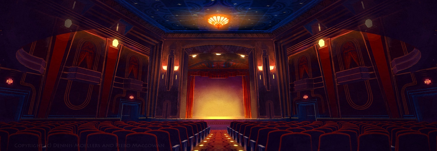 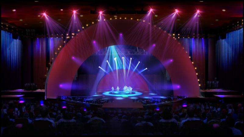 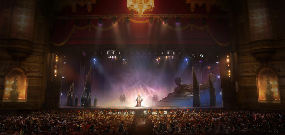 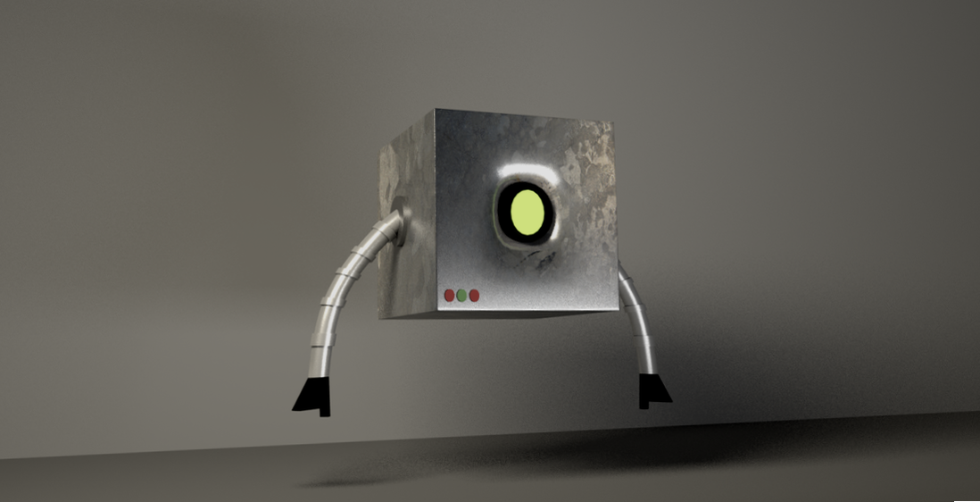 Did these quick models as tests on Maya. I created a simple version on the box robot I drew in a concept- I wanted to figure out how to UV map a texture around the cube shape and round the dented part where his eye is. I think it came out okay for a first attempt, the image I used doesn't look distorted anywhere. I was also playing around with the aistandard and emission settings for his eye so that it glows. Considering our scene might be quite dark it would be cool to have lit up eyes in the crowd. 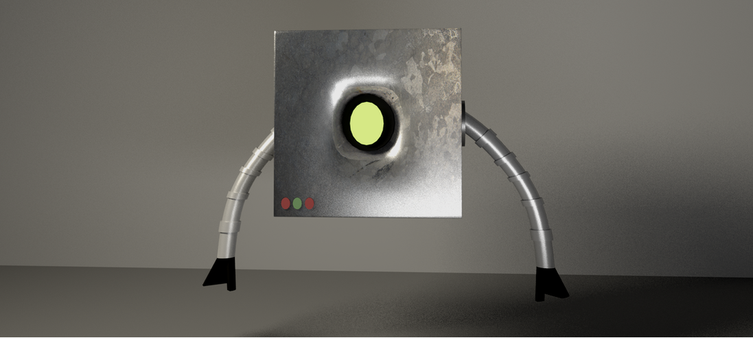 Also tried creating a really simple character design in case we need any models for the front row of the audience. Basically just messing around with basic shapes.
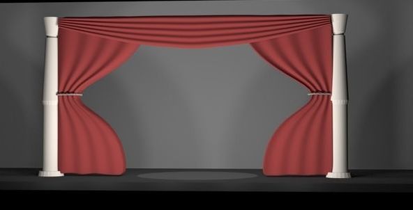
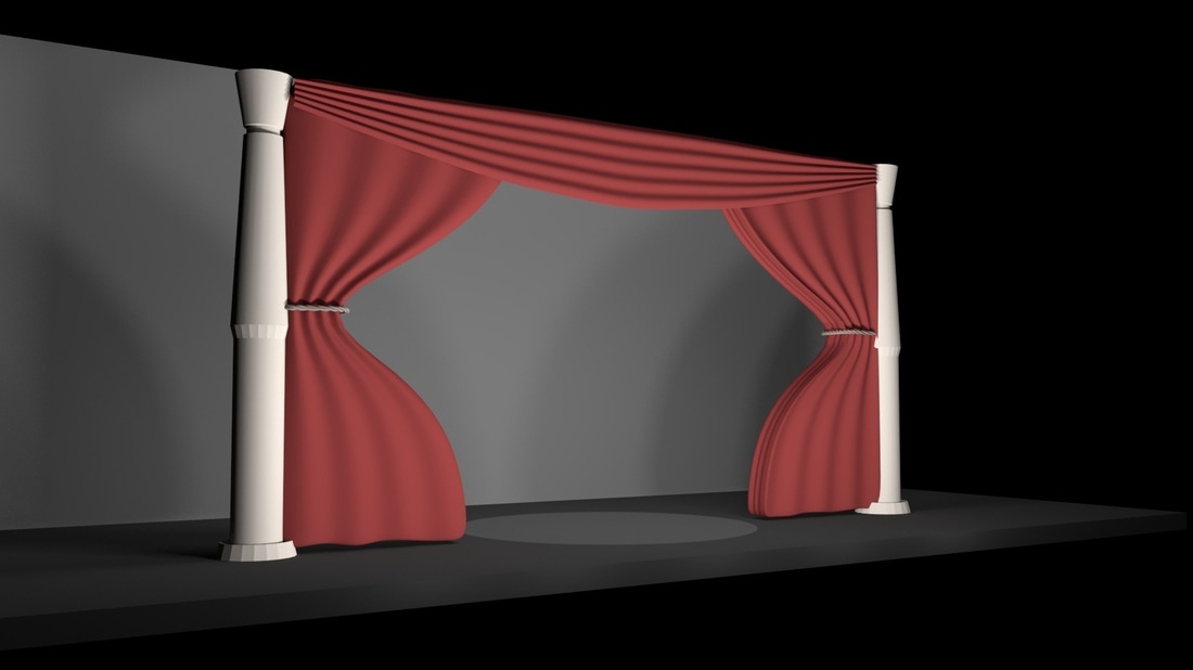
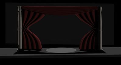
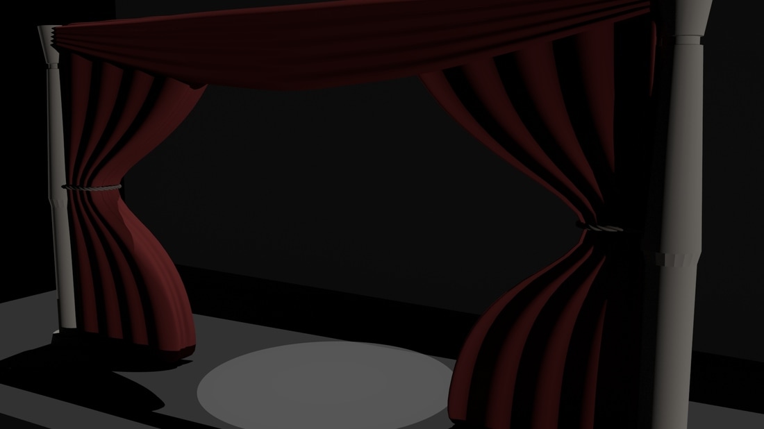
I wanted to figure out how to make a curtains as well so I came up with the really basic scene below as a stage setting. Turns out curtains aren't hard to make at all so I'll be able to re-create nicer looking versions of these. I was also trying to figure out how to get nice lighting when just the spot light is on.. so it sets a mood. I don't think I did a very good job so I'm going to look up some ways I can improve this!
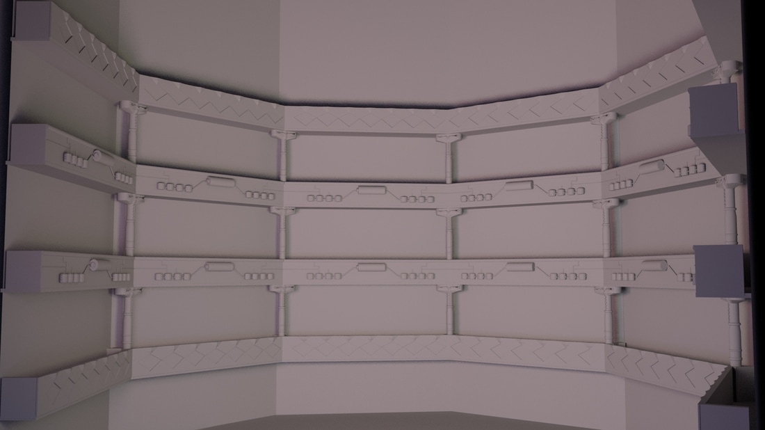
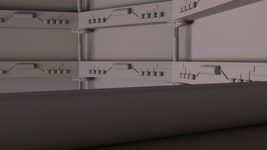
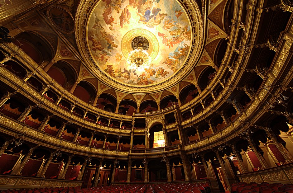
Other designs I was messing around with where the balcony designs. We kind of want the setting to be more robotic like considering our characters live in a robot world.. So I made a simply balcony with four nodes on either end and in the middle they are attached to a battery. The other simple balconies just have a basic pattern on them. I also placed them out like inside and opera house just to see how it looked. 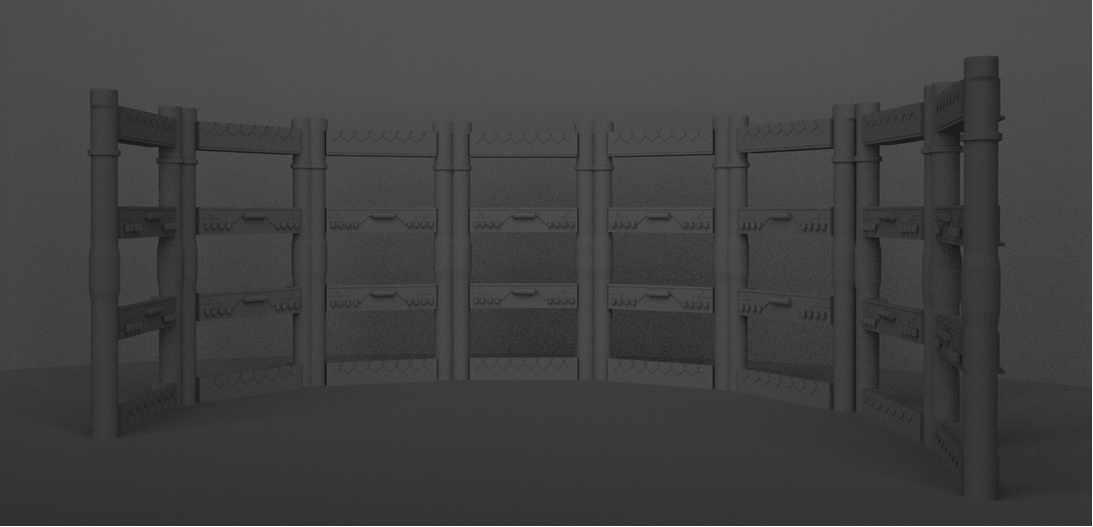  UPDATED VERSION Used the old balconies I made to do a more structured looking version, also changed the way the pillars looked to match references I was looking at. I haven't added a roof yet because I don't know how detailed it will have to be. 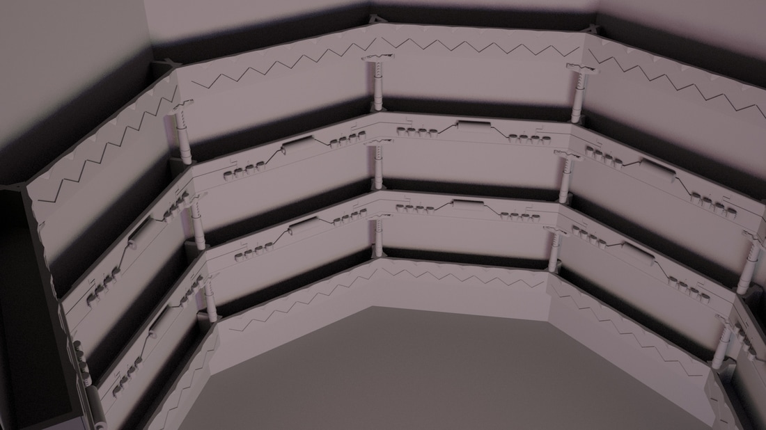
Reference images (source)
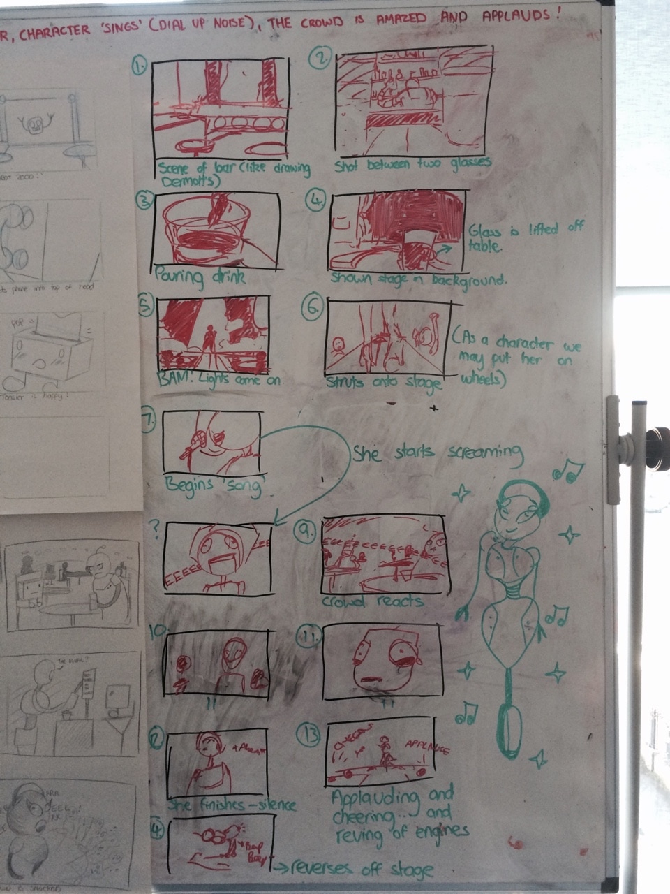
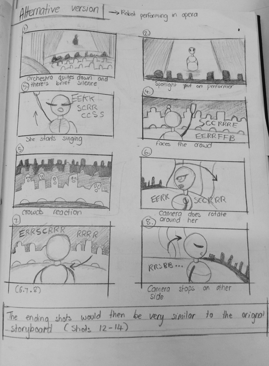
 For our opera singer idea we drew out a new storyboard to follow. We didn't want to repeatedly re use shots or do shots that didn't look right so I was looking at scenes from Citizen Kane and Phantom of the Opera to see where they placed the camera. Using these examples we were able to use similar camera shots in our storyboard.
These clips also gave us a good idea of how our lighting should be as well depending on how bright we want it to be inside to opera house.
My frames Above is our new animatic with the opera house. We think the story fits better within this setting (and the time frame) but we need to work on making sure there's less camera shots cutting to different angles.. it looks very rushed. We are also going to work on character designs a bit more so that it'll be more goofy.
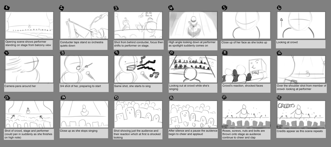
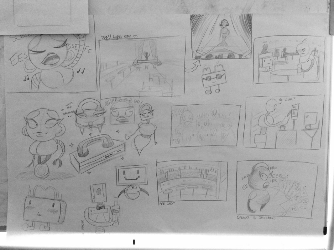
Below is the animatic we presented based off the rough storyboard I did previously. We also put it into a digital story board and realised that it was too long so we had to cut some scenes from our animatic to fit within the time frame.
Credit to rest of group for their panels. Ryan laid out the storyboard and I typed it out. Credit to Ryan for putting animatic together and adding sound My frames
Doodling ideas down But we decided to change our setting to an opera house rather than a bar because it kind of suit the idea better. Based off our feedback, for the animatic we presented, it also seemed like an more simpler way to approach it. It also meant we could come up with a design for our modem character being a very large opera singer while the audience are posh household appliances- this would make more sense to the audience watching our animation. Points that where also made to us where that we should probably make the dial up noise more annoying than it already sounds and make it a bit more screechy and shocking.
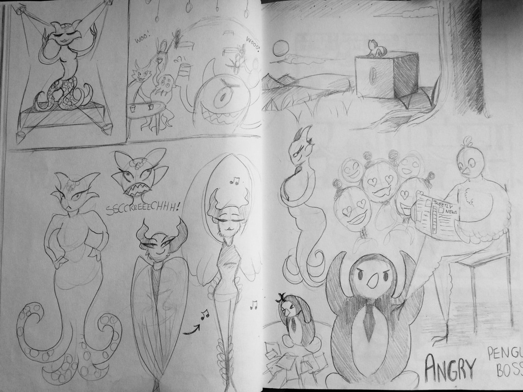
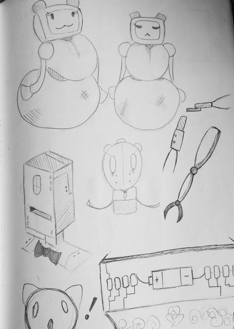
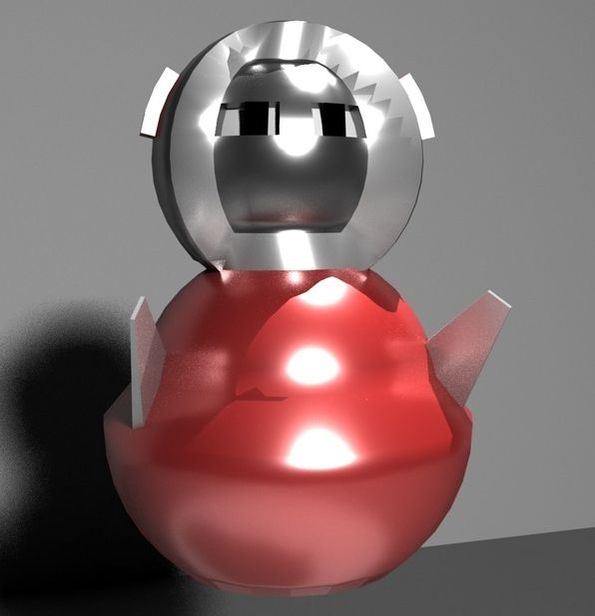
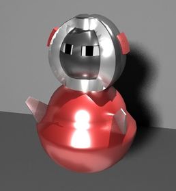
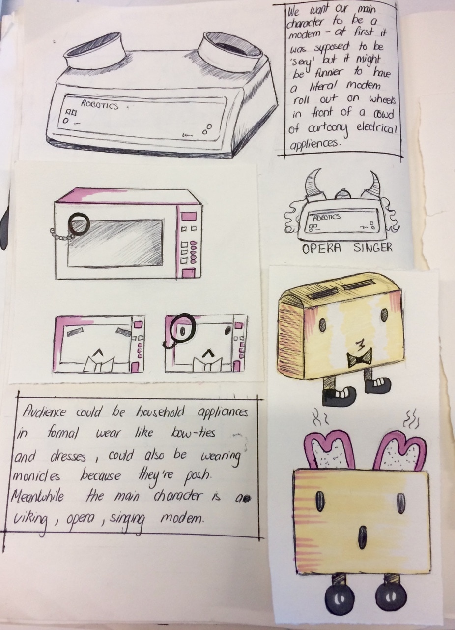
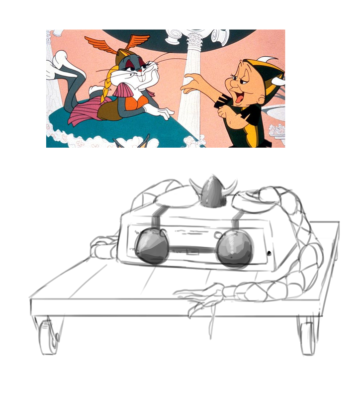
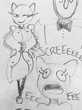
Some rough characters designs I drew We starting coming up with a few new designs. We had the idea of the character literally just being a modem rolled onto the stage on a cart or something.. but it would be a bit confusing to the audience if they don't know what a modem is- people from the rest of the class even told us, although it looks funny, they actually have no idea what a modem looks like so they don't really get it. Ruxandra drew out a few really nice designs as well and one of them being a really chunky looking robot that rolls about on a ball. We thought we could use this kind of design for our main character instead and make some slight adjustments if needed.
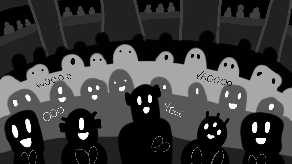
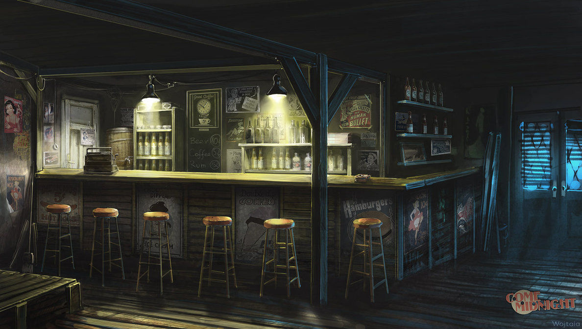
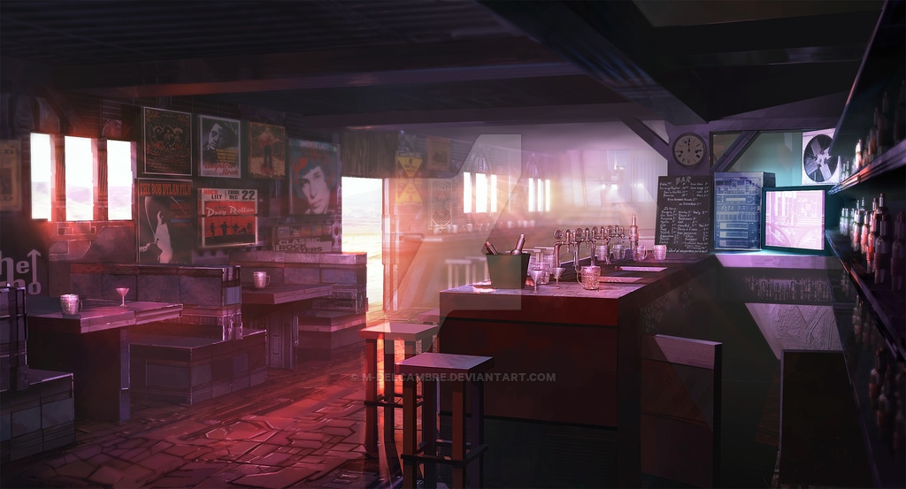
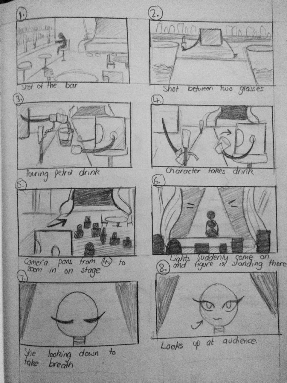
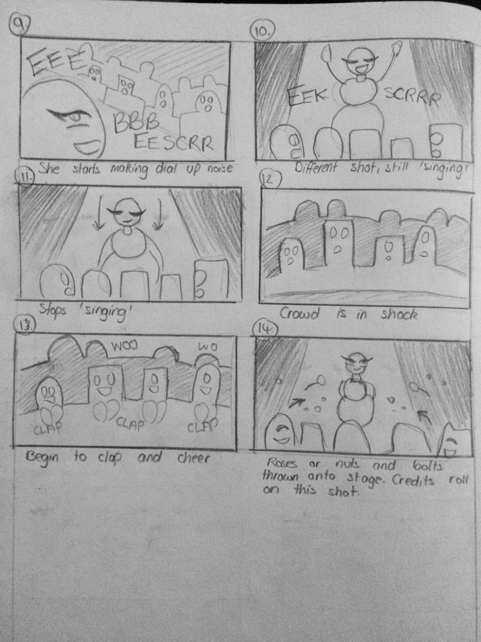
 Storyboard and character tests We where also looking at scenes in movies where characters enter are bar or are watching a performance in a bar. This was so we could get an idea of what kind of mood we should set and how the characters in the background/crowd would behave. Examples I looked at were parts from Who Framed Roger Rabbit (1988), the scene where Jessica Rabbit performs in a bar scene.. it's basically the kind of idea we are thinking of. A similar I was looking at was a scene in Blue Velvet (1986) where the character Dorothy performs- although it's more of a clam scene. You can also see what kind of mood these scenes set, the lighting is low and there is either a warm or blue hue depending on whether the bar is a comfortable setting or not.
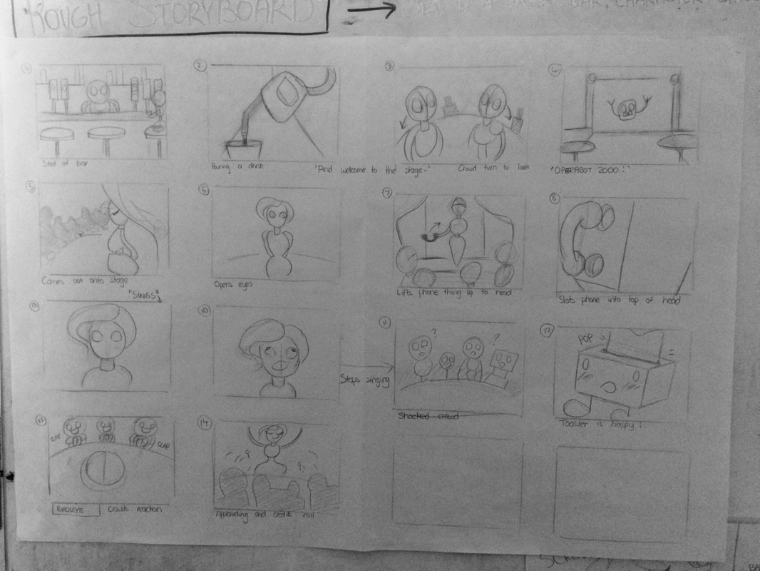
You can see the comparison between the two images below. On the left the environment is a bit eerie and sad looking and on the right the bar is warmer looking and seems like more of a friendly environment. 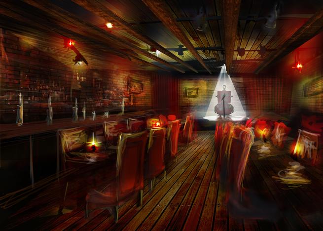 Dermott's concept art of bar I drew out a rough storyboard for us to us when creating the animatic.
I was also looking at some tutorials on how to create unique characters using basic shapes. It's why we are using a lot of curvy shapes for our female character, it also will give us a good character design to work with in Maya.
Initially our group went off to come up with a few ideas and characters individually to see what we could intentionally use. I did some random character drawings- one is a box (robot) and a frog that are best friends, a little robot character that needs to plug itself in to charge, a super toaster and a pool party monster. And I have no idea where I was going with the budgie with a top hat one. Our group decided that we wanted the animation to be funny in some way and we could either use robots as characters or monster type characters with basic designs. 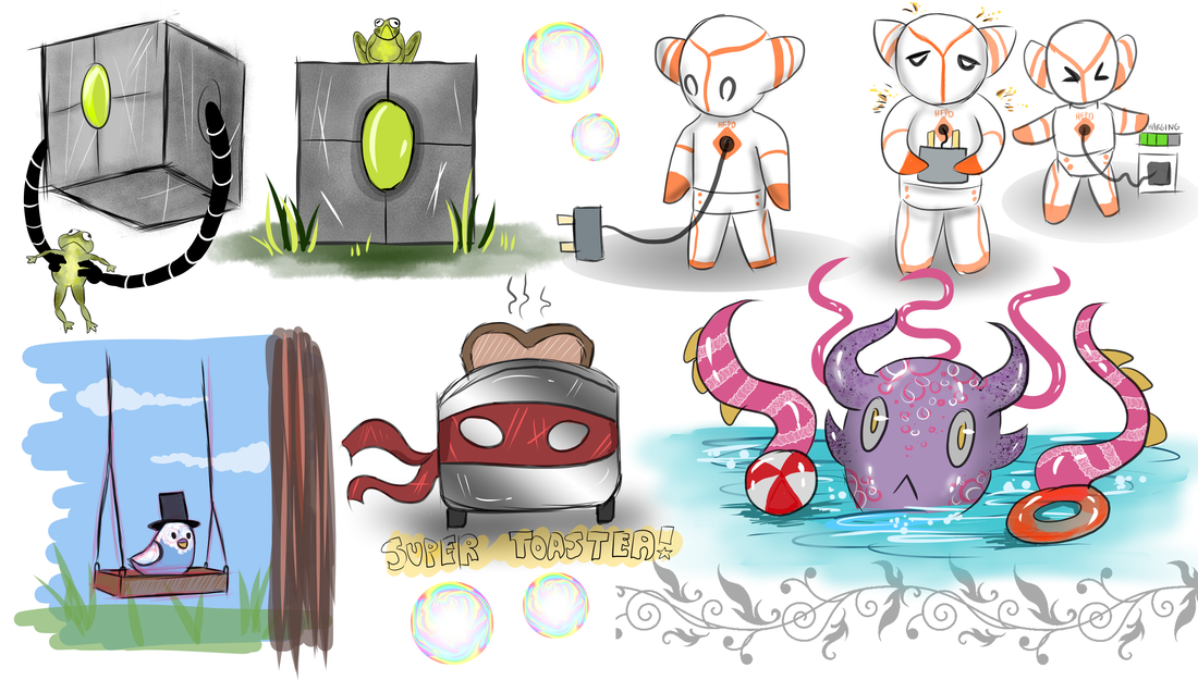 My character concepts
 Character designs This is the noise we want the character to make- in her world it's like she's 'singing' Rest of Groups Blogs
Ruxandra: https://ruxandragp.wordpress.com/ Ryan Loughran: https://lockosblog.wordpress.com/ Dermott Burns: https://dermottburns.wordpress.com/ |
 RSS Feed
