|
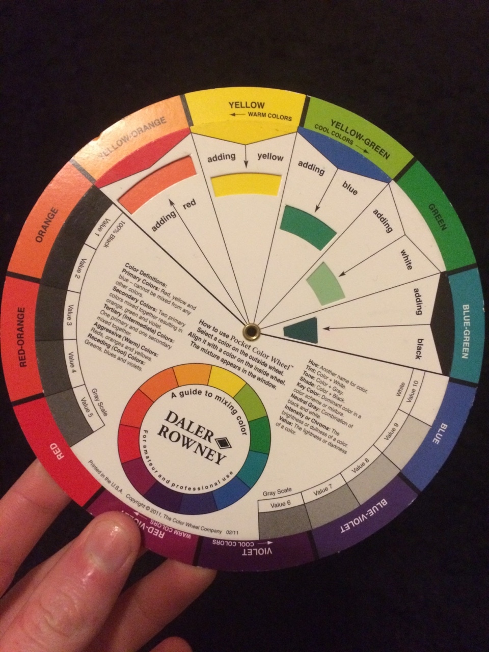
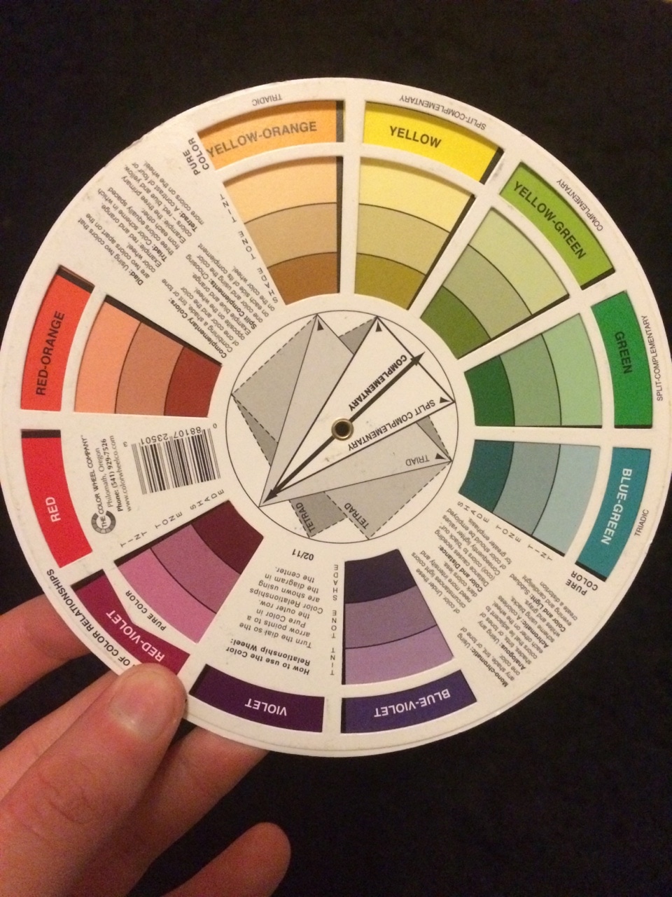
Moving on from tonal studies we are starting to look at adding colour to our work! Without references my colouring can be a bit all over the show but most of the time I end up using a colour wheel I have. I casually took this from a paint store (paint for houses and walls.. not even art) ages ago and constantly use it when I'm colouring. I find the back part most useful as it shows colours that complement each other best.
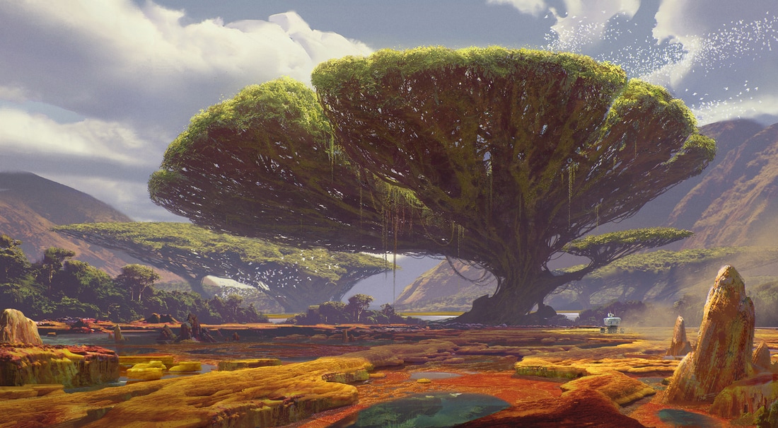
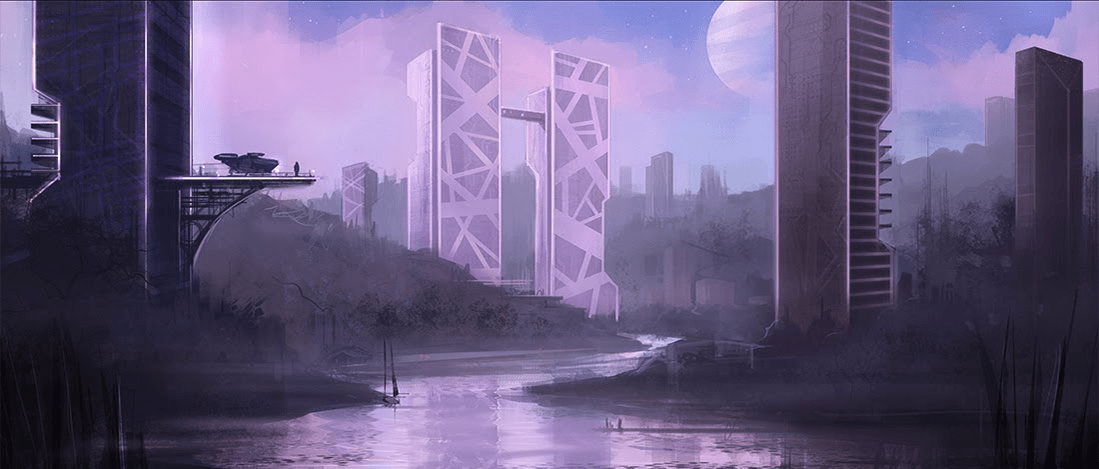
Again I ended up looking at Jordan Buckner's art, because not only does he do really good tonal studies, he is also very talented at creating environments using colour. He's able to take one colour and create an entire scene using it simply by changing thr tone or shade. You can also get a really good sense of atmoshpere from his drawings. I particularly like the first image I've shown of his work as it reminds me of one of our characters, a Big, standing in valley. 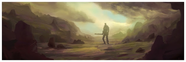
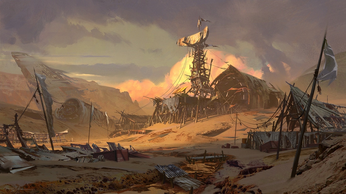
Another artist I looked at is Sung Chaio (their art can be seen here http://www.sung-choi.com/gallery/). The art in their gallery are finished pieces and are incredibly detailed but when looking at it in terms of colour you could compare pieces in relation to warm and cool colours. They use this technique to help set the tone for their drawings.
0 Comments
Leave a Reply. |

 RSS Feed
