|
The 12 Principles of Animation Created by the pioneers of animation, Frank Thomas and Ollie Johnston and first introduced in 'The Illusion of Life: Disney Animation', the 12 principles of animation are seen as the 'ultimate guide' for creating appealing and realistic character animations. Using these principles can help you animated something that seems more 'real' in terms of how it moves, and how that movement might be used to express character and personality. They don't always have to be included depending on the style of animation you are going for but they are good basics and despite originally being written for traditional 2D animation they still apply to 3D animation. Other books and animators such as How to Make Animated Films: Tony White's Complete Masterclass on the Traditional Principles of Animation and The Animators Survival Kit discuss these principles in depth and their own thoughts on how to approach them. Although animation can be approached whatever way you wish, if you want to keep within the requirements of the industry you will find it easier and better to adhere to the basic principles of animation. It’s not about mesmerising the principles but whether or not you truly understand and can utilize these ideas that matter. 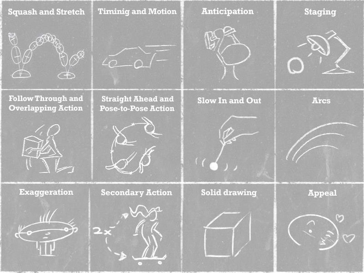 Squash and Stretch
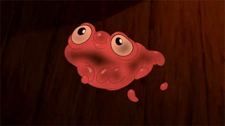
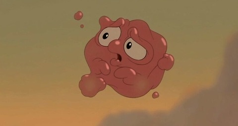
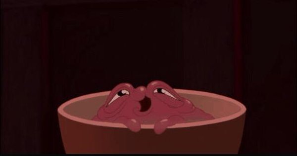
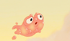
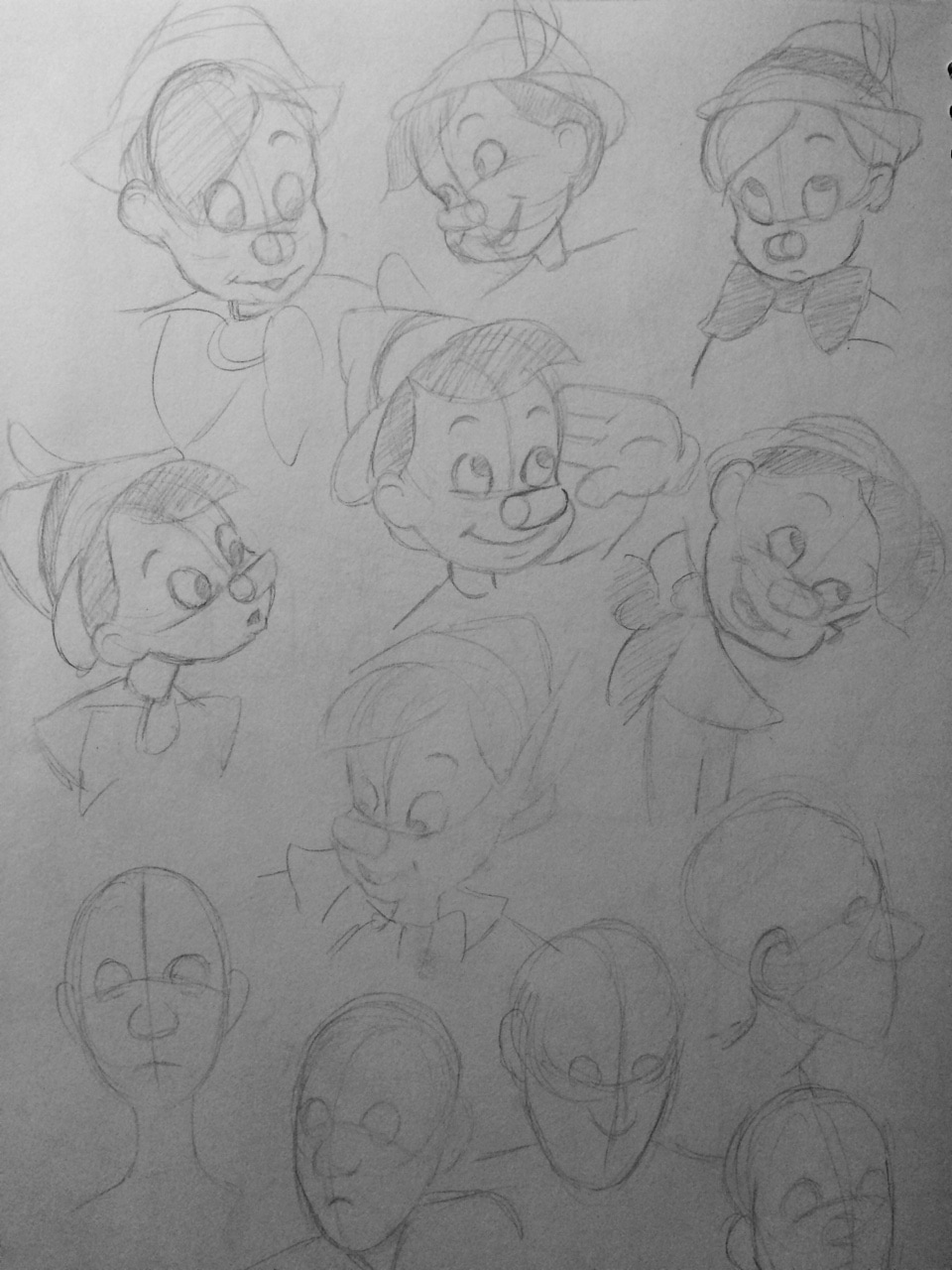
(I looked more at these principles here as well) Using the principle of Appeal we are to create a character design. I started looking up existing characters for inspiration, like the goofy side kicks in the likes of Disney movies to see their designs and shapes. I came across my all time favourite- Morph From Treasure Planet. He is the simplest character but is just such a lovable blob. Although his design is simple it's the way he moves his body, his expressions and personality that makes him such an interesting character.
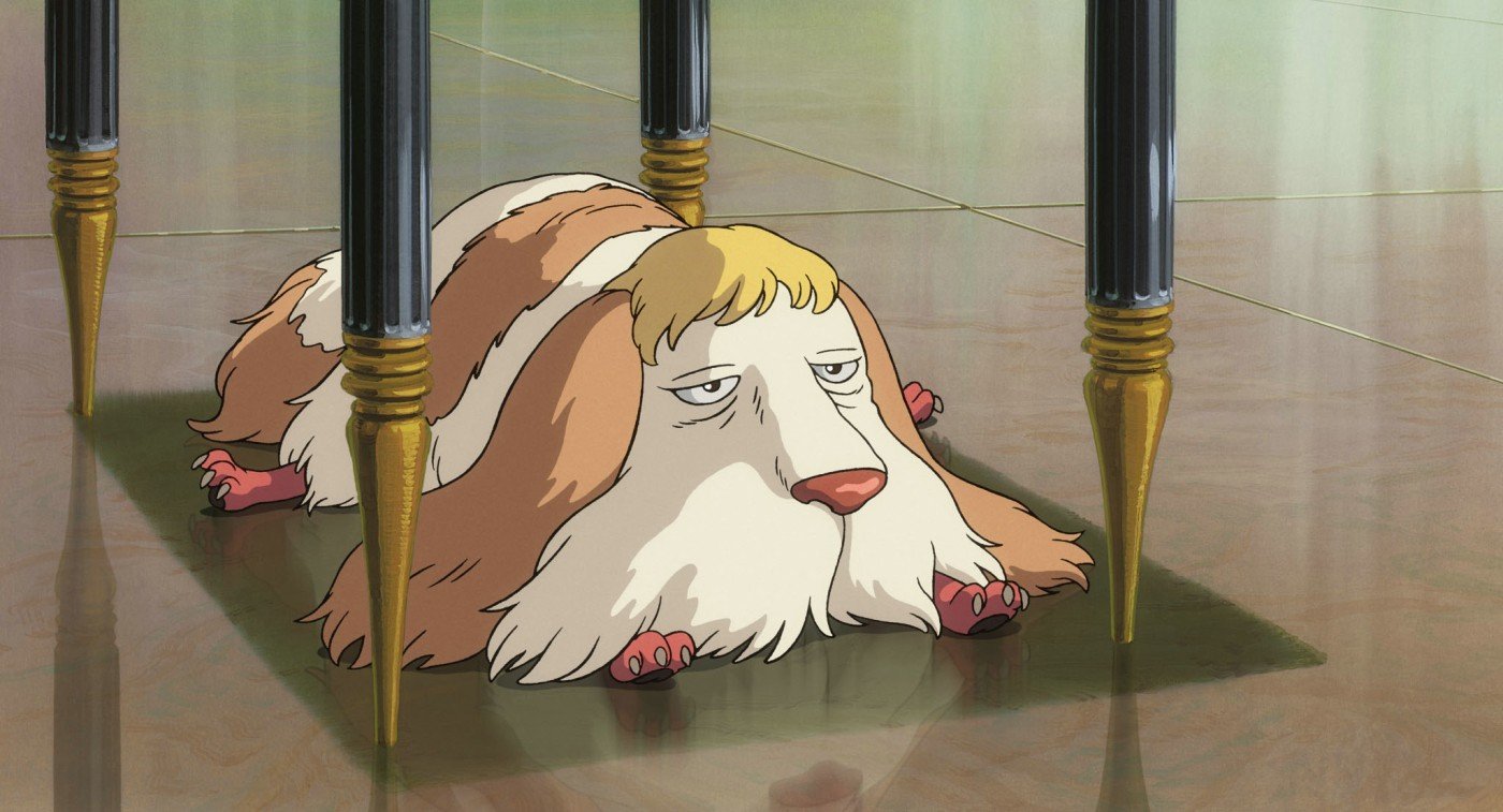
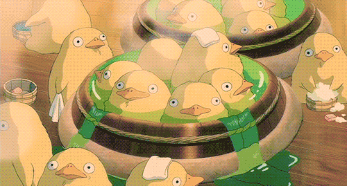
Morph from Disney's Treasure Planet (2002) I was also looking at the designs of some of the Studio Ghibli side characters as most of them are pretty unique. I particularly like Heen from Howl's Moving Castle.. he has bird feet rather than paws and is always grumpy. And the giant, duck things from Spirited Away because they are hilarious looking.
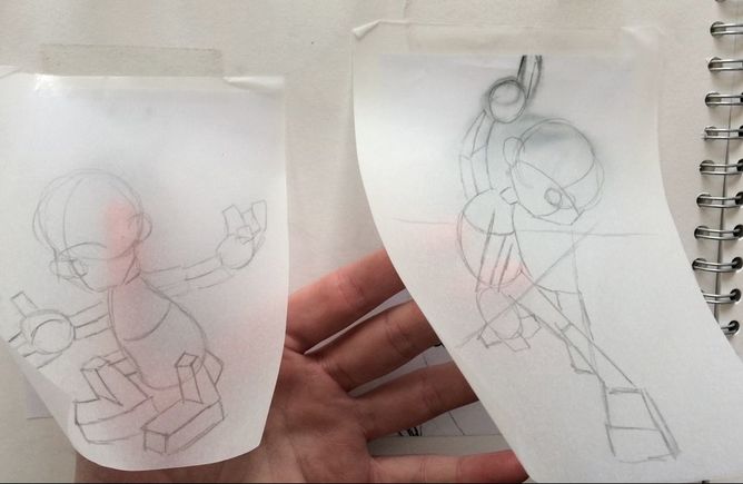
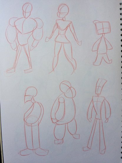
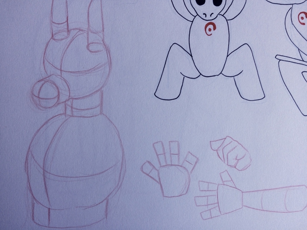
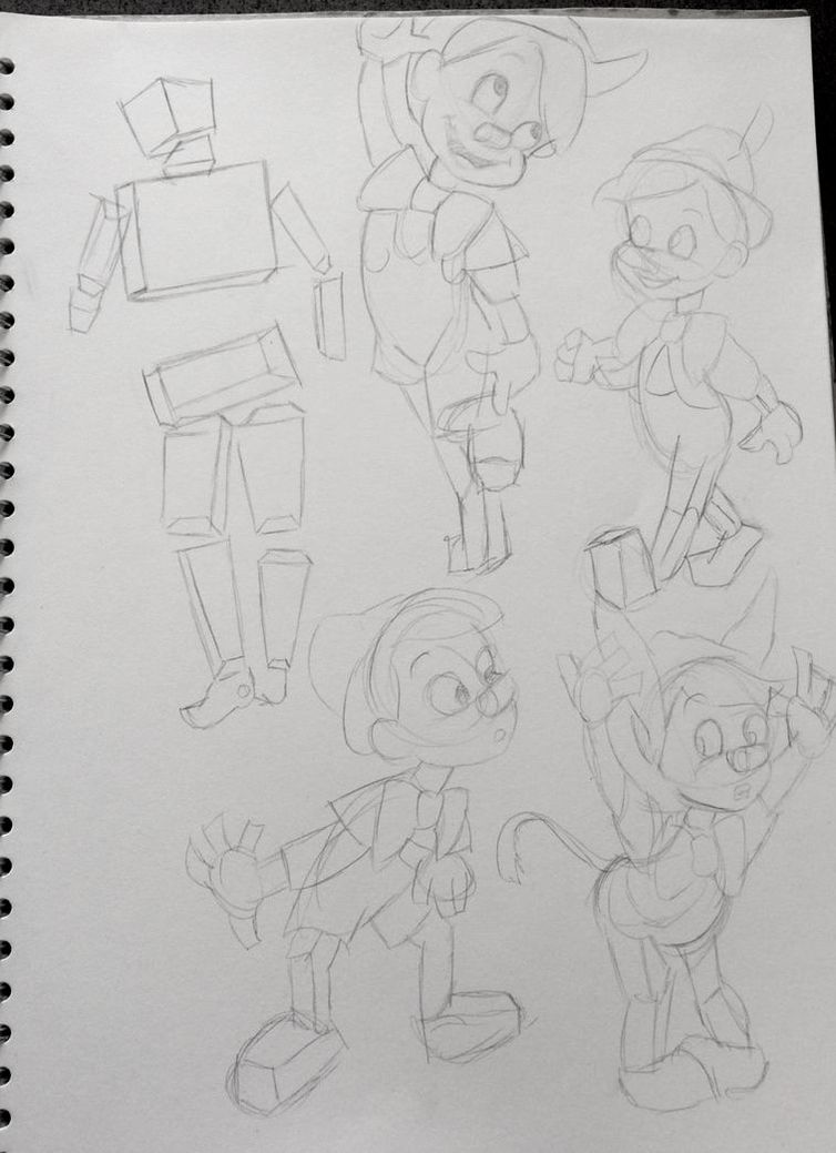
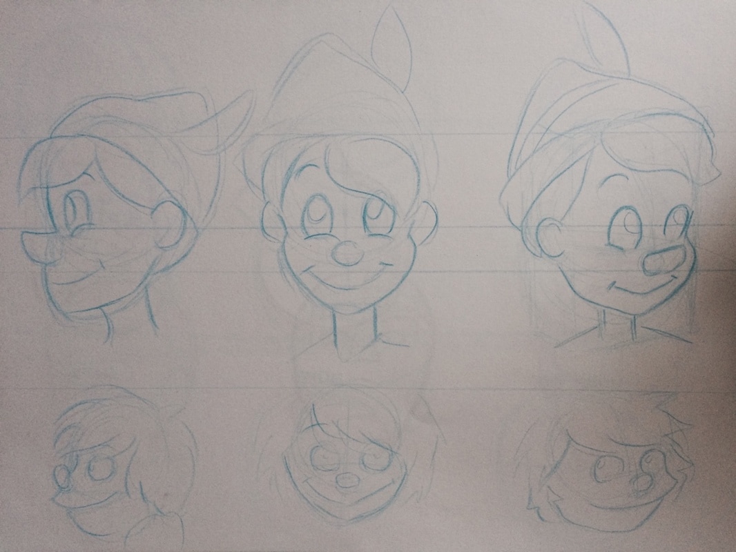
I started by playing around with some basic shapes for characters to show what kind of build each of them had. I drew the shape of the characters out first then re-drew them but added a design that came to mind based of the shapes. An important factor for the principle of Appeal is to use a variety of different shapes when designing a character- every good character deign starts with a basic structure of shapes. The shape of a character can also help give a better understanding of what their personality is like for example a slouched over shape can make the character look tired or grumpy, a large chest and shoulders with narrow hips and legs can make the character look more powerful or proud. Another is to keep it simple, too much detail can be distracting and also makes the character difficult to animate- I tried to give these practice characters very simple outfits.
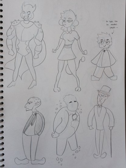
You can see how I tried to start with basic shapes for these characters and add some sort of 3D structure, I wanted to go back to keeping a simple yet appealing design.
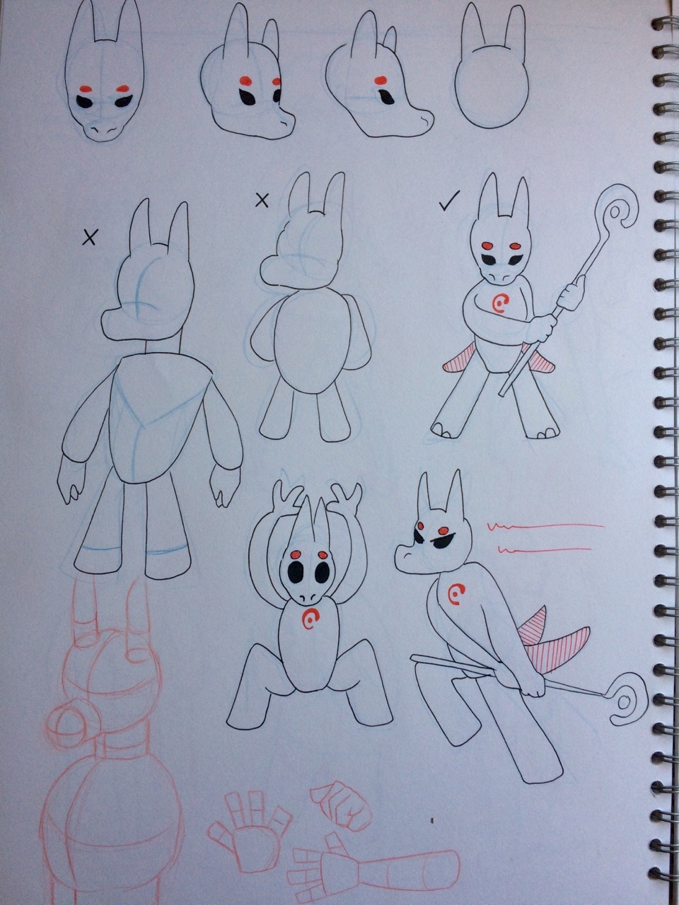
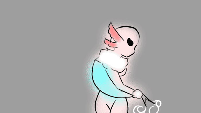
So developing the moth girl further I came up with the design shown below. I think keeping her curvy with unrealistic proportions makes her interesting looking and the the fluff around her neck, wrists and ankles helps give her a more 'cutesy' look. I liked the idea of doing an exaggerated 'girly' character kind of like Madam Mim when she makes herself look like a pretty woman. 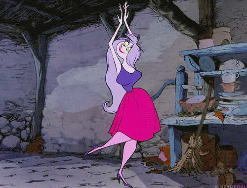 Madam Mim from Disney's Sword in the Stone Using her basic shapes and proportions I attempted to do some different poses with her to see how consistent I could keep her design. The thing with appeal is that it can all be down to personal taste- I tried to keep her design cute and colourful to stick to an atheistic that most people would like. 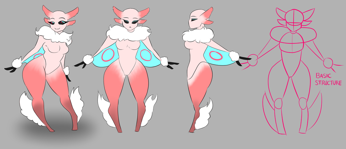 The first batch of drawings are poses that contain a lot of perspective so I tried drawing these poses using this characters structure. I struggled with the sitting down pose where the legs are sticking out- considering this characters feet get really narrow at the bottom I wasn't quite sure how her legs would look with this pose and perspective on the legs. 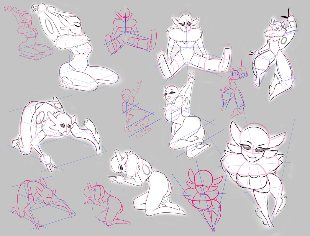 Drawings below: I've drawn lines of action and applied the design of my character on top with a pose, making sure I keep her anatomy right while also making her look believable and balanced. This is probably one of my favourite things I've picked up from life drawing classes. Using these lines helps me visualise the characters pose before I even draw it and helps to emphasize any emotion they may be feeling. It's also helped me give these poses more balance meaning they don't look stiff and lifeless- this also improves the appeal of the character. 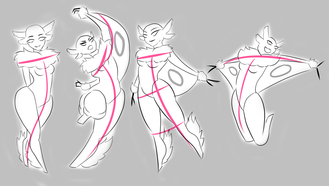 Another principle of animation I took into consideration when drawing different poses of my character was Solid Drawing. As I was looking a balance using basic lines and line of action I also kept in mind the volume and weight of my character when drawing her in an open space. Drawing different angles of her basic shape (in 3D) helped with this and below I drew out a rotation of her head along with some different expressions. 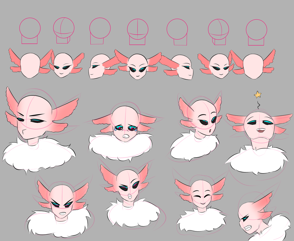  Squash and stretch test 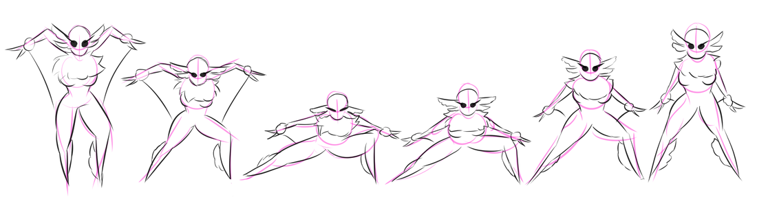
The style I went for with my character is based off manga and the ‘cutesy’ appeal it has. Of course, whether someone likes the design of a character is all down to personal preference but with this style I am able to redefine the norms (for example with the exaggerated curves, the eyes and face). Even though the character can look simple to begin with, usually in this style they transform to have some sort of power/ magic ability- a bit like superheros, and who doesn't love superheroes? In terms on animating a character like this, the style of manga (or anime for animating) allows you to have an engaging story and despite some characters looking a bit crazy they are relatable, the style can also be a visual spectacle. With this style, I can also execute all twelve principles of animation because the design allows me to flexible with it. I chose to design this character this way because I thought it would be an interesting character to look at but also fun for me to practice drawing techniques on. 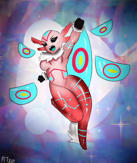 References
0 Comments
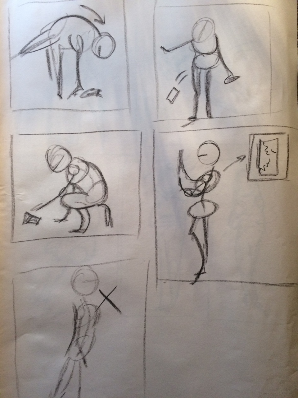
1 minute warm ups
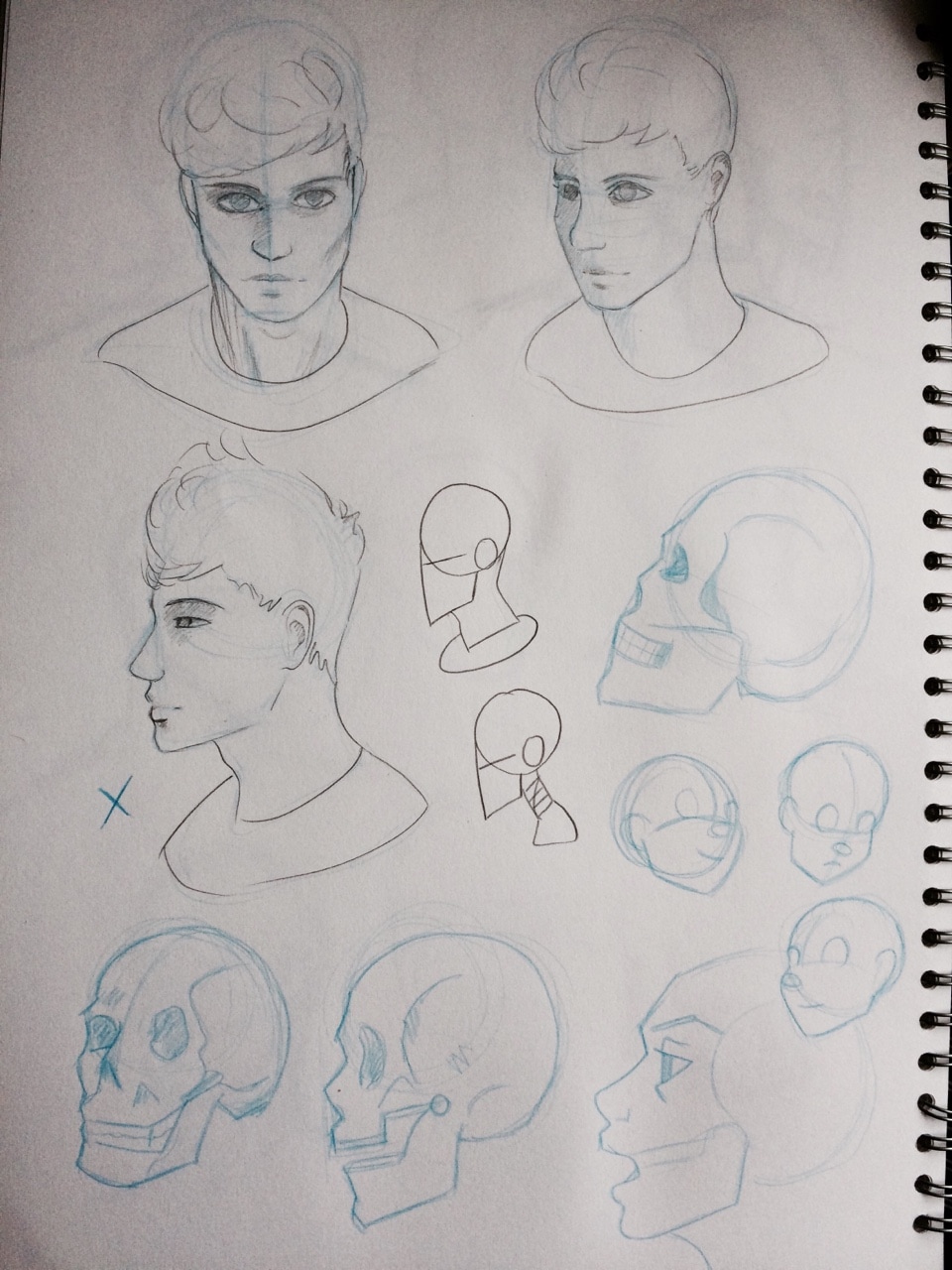
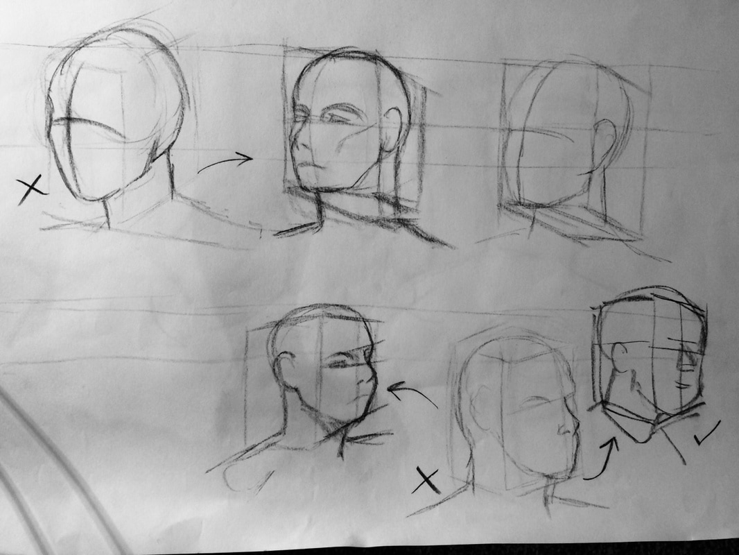
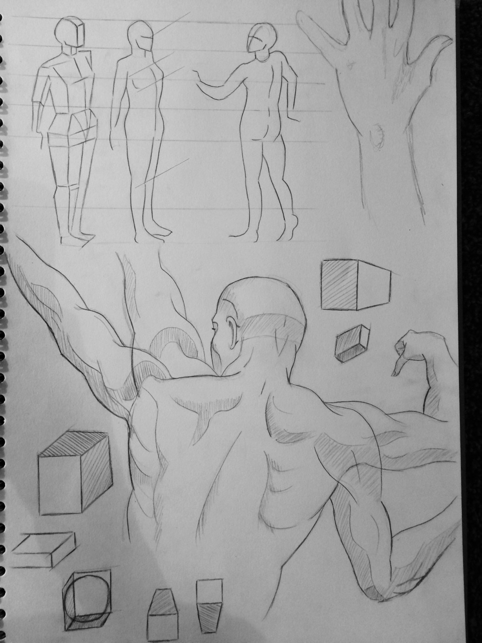
You can see my failed attempt at a profile drawing (one with X beside it).. Proportions look completely off and unnatural where as the one of the female (bottom right corner) looks a lot better. More practice needed.
Drawings for homework
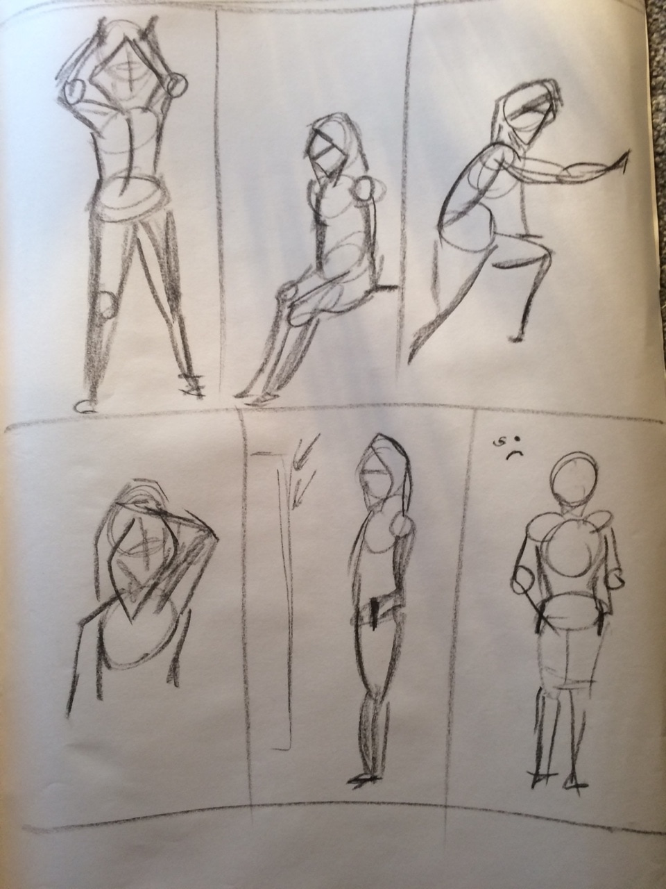
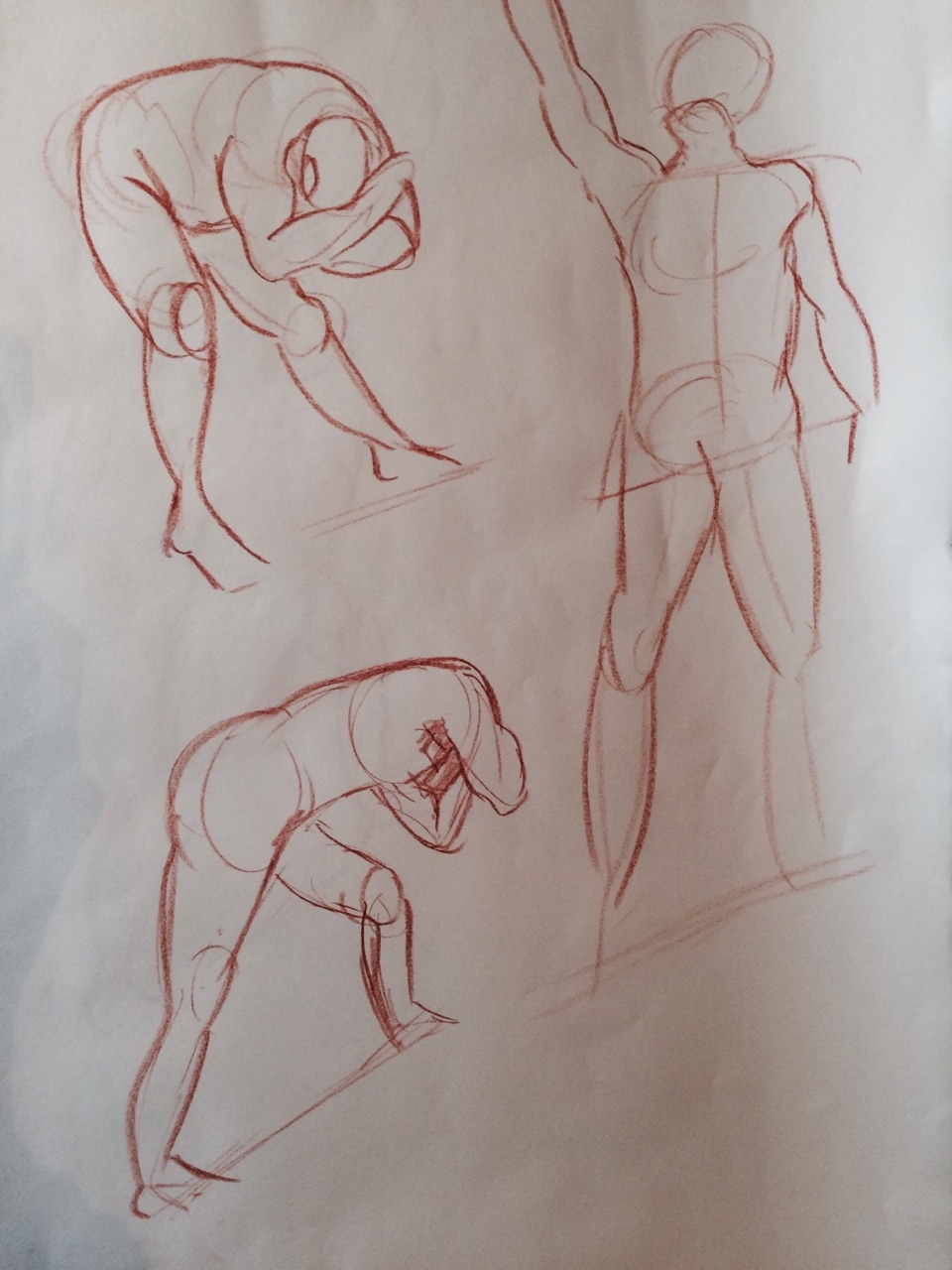
1 minute drawings
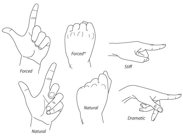
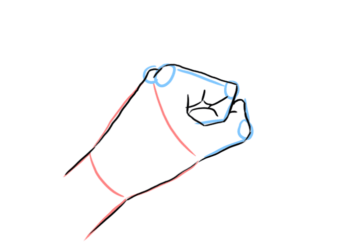
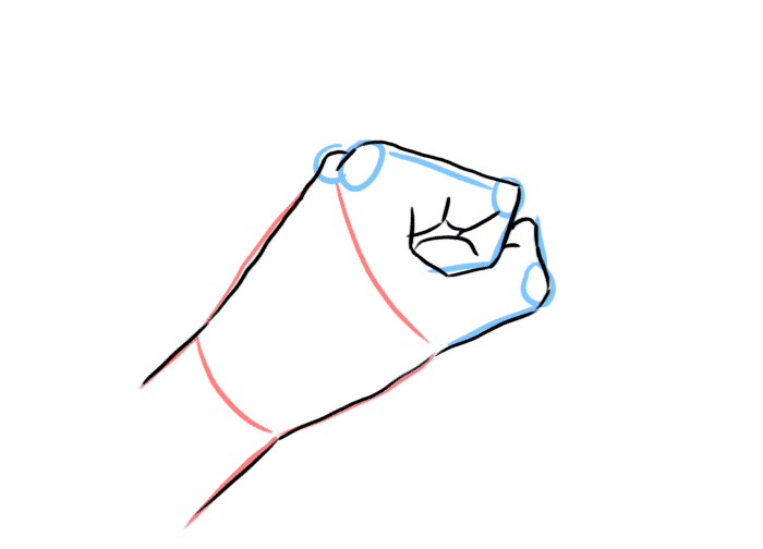
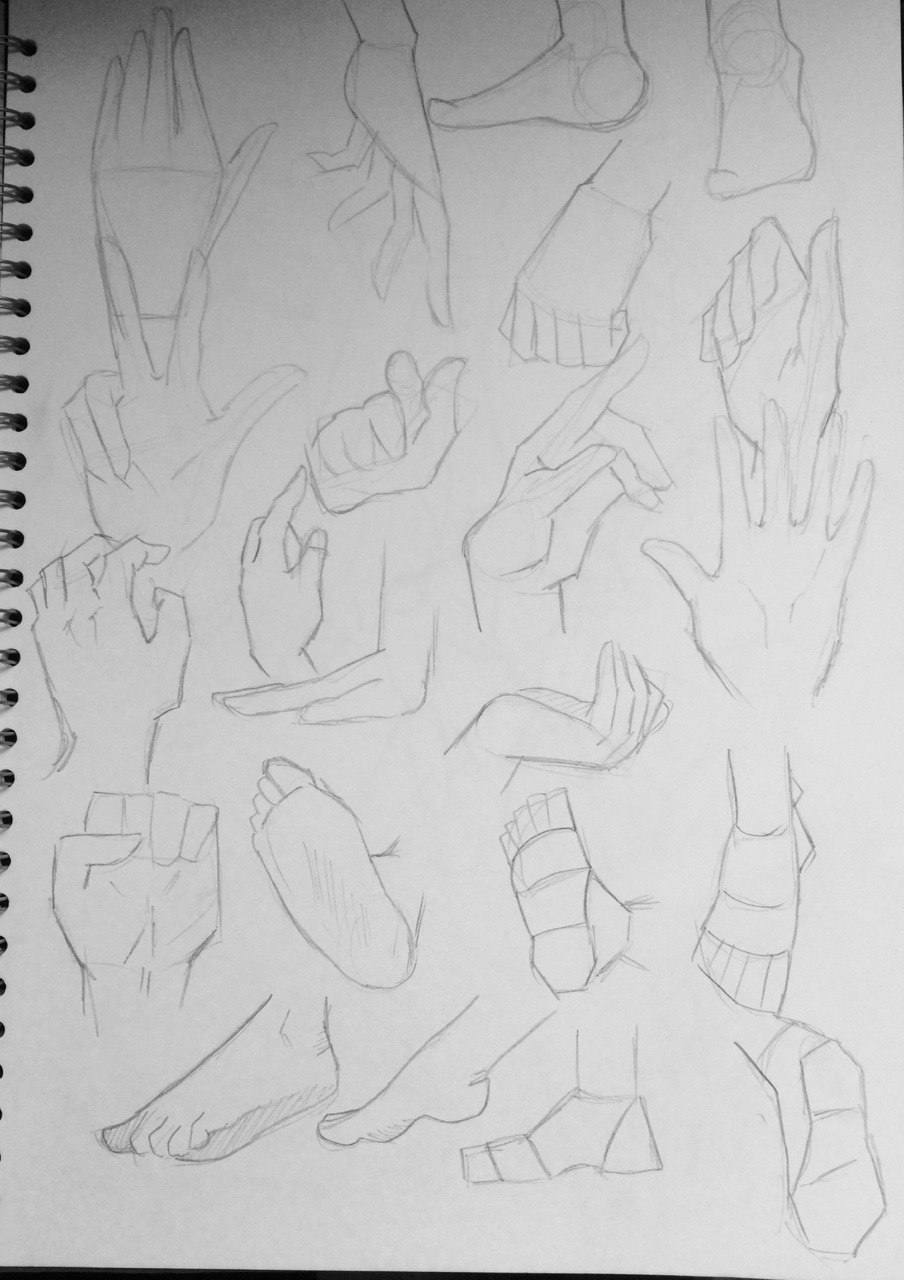
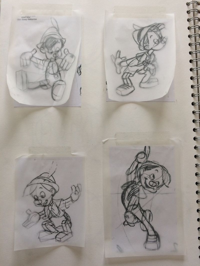
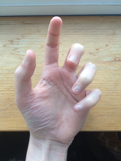
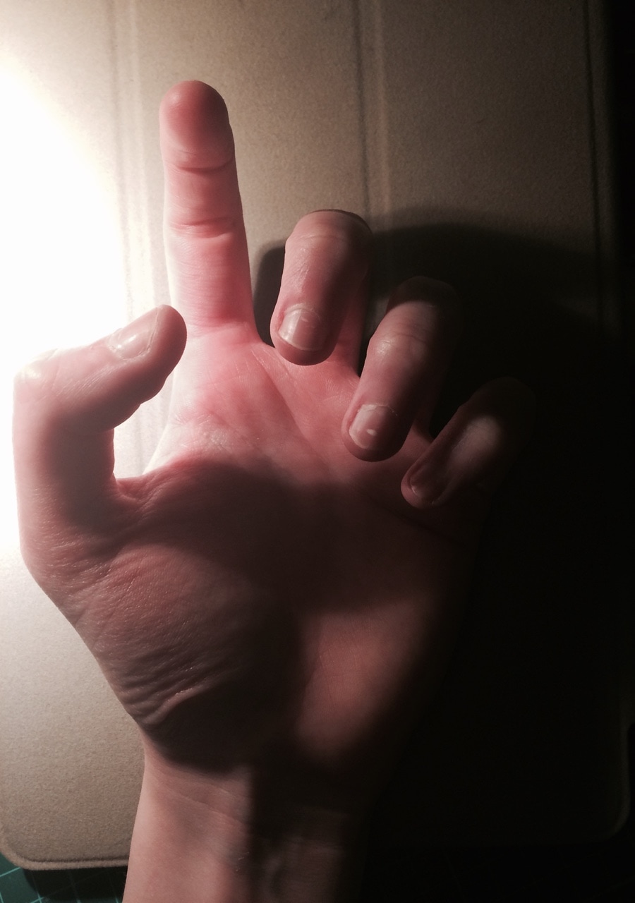
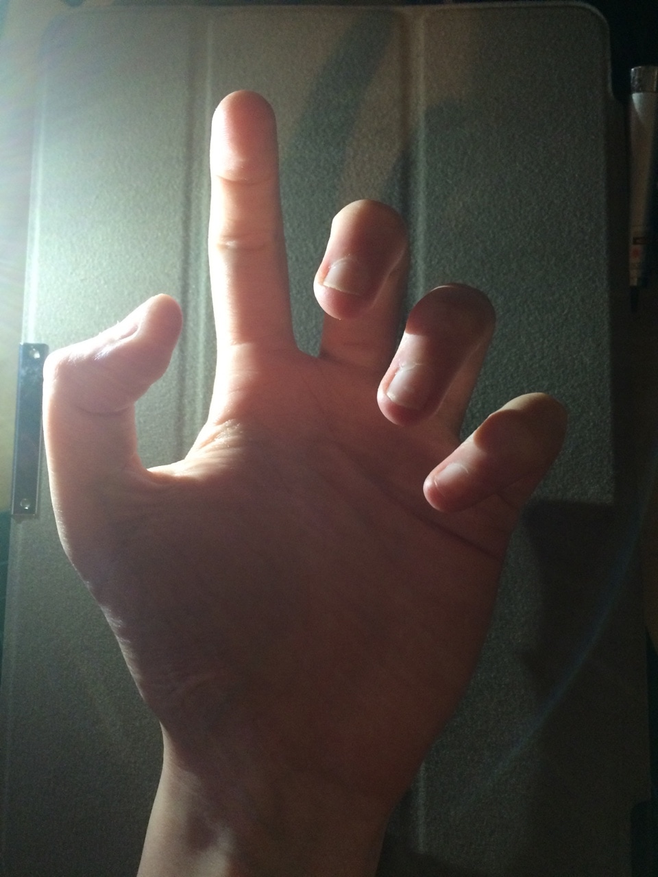
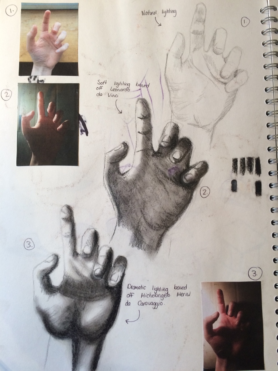
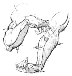 I was also looking at the work of Burne Hogarth, he actually has an entire book about drawing hands (I've actually already drawn replicas of his stuff into my on sketchbook before). His teaching is pretty solid and his work is to an incredible standard- the techniques are a really good way of visualising the hand in lots of different positions. (Example of his work can be seen on left) As part of our homework as well, we where to create a 2D animation showing different positions of the hand
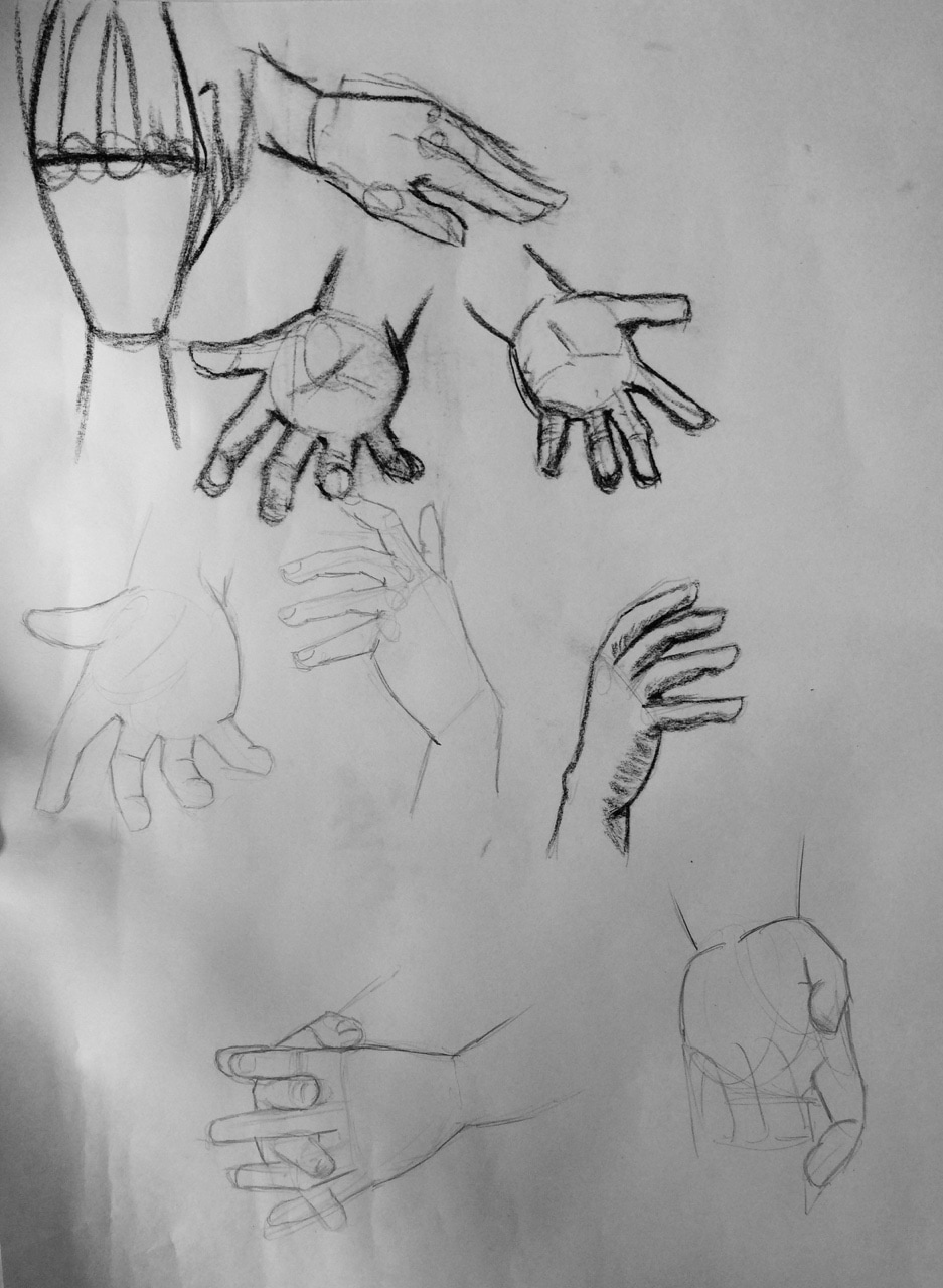
I made the animations above. A clenched fist opening up.. with basic stucture
Some more tests, I used my own hand as a reference when making all these animations! 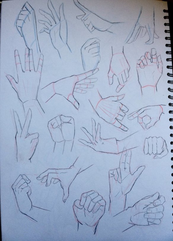 Drawing more hands as practice
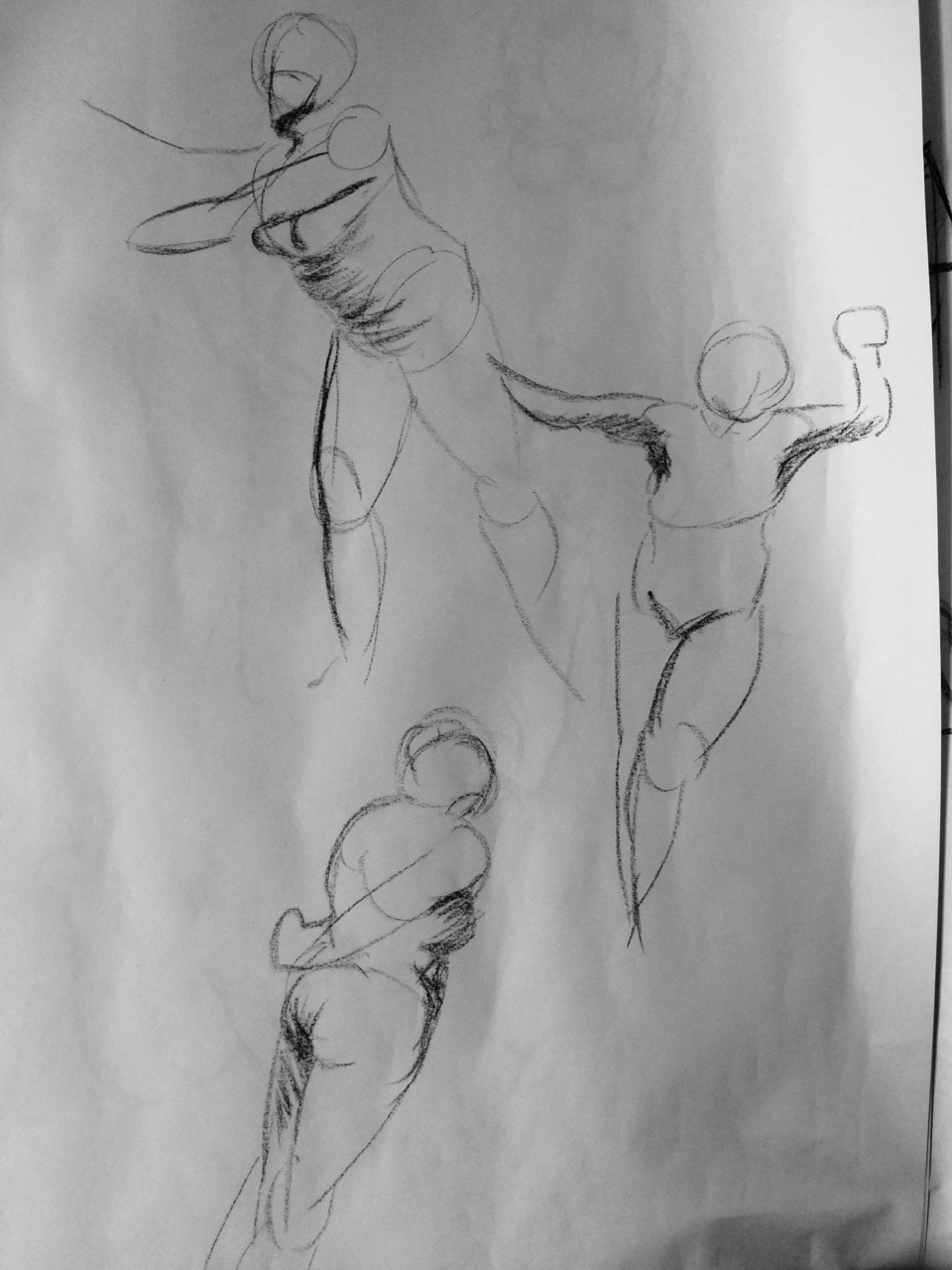
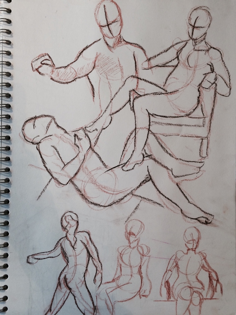
After our 1 minute warm ups today we looked at drawing out the models pose in a storyboard format. So the model acted out a story in frames and we had to quickly draw down what was happening in the story. I think in my attempts I was to focused on trying the copy the models pose exactly rather than just focus on the story and how the 'character' is expressing themselves. You can kind of see how my sketches don't really make sense.
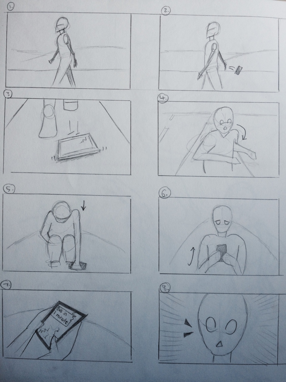
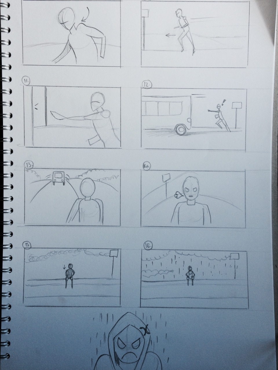
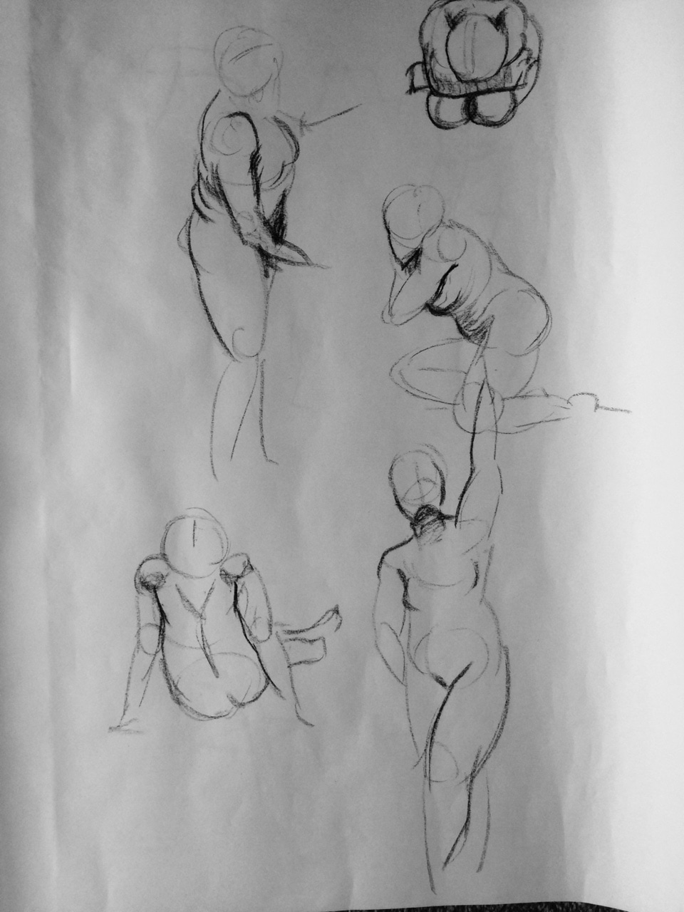
As homework we where to re draw this story again only this time focusing on the body language and how the what the character is actually doing. So in the story I drew the character is walking for the bus but drops their phone and it smashes, their bus is then leaving the bus stop and they have to run but miss it. They sit down and it starts to rain.. they are not having a good day.
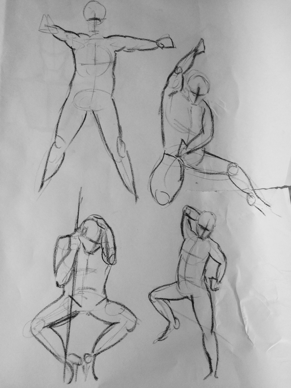
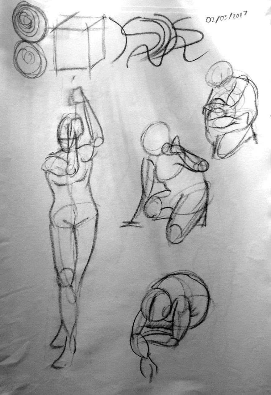
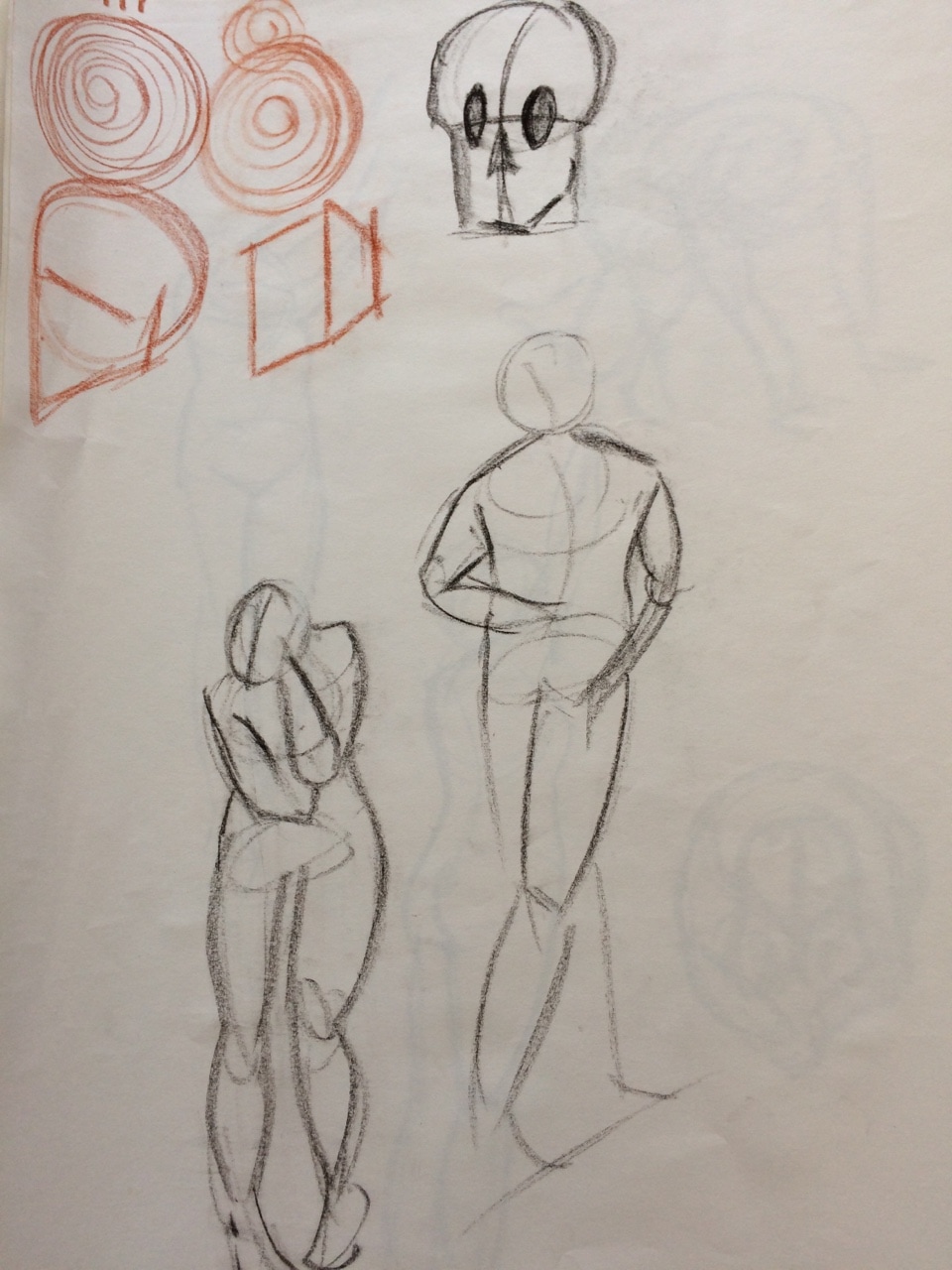
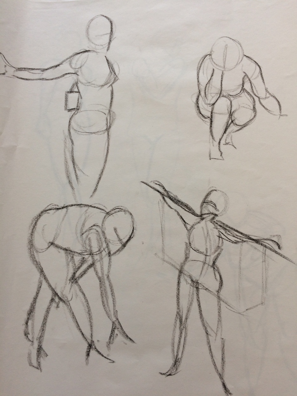
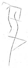
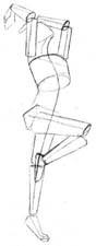
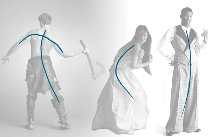
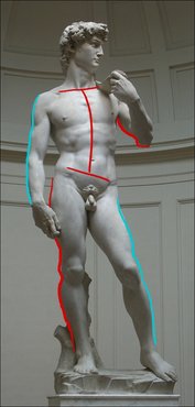
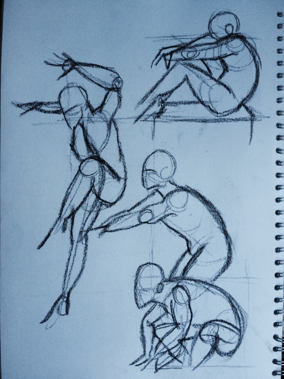
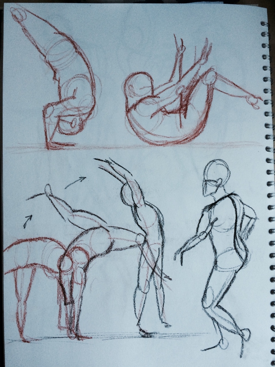
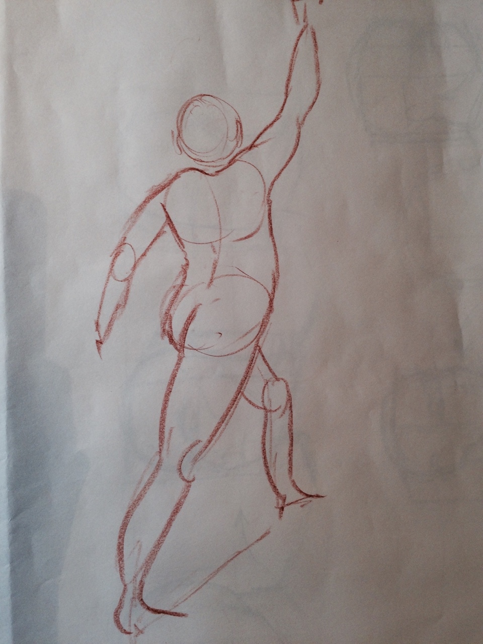
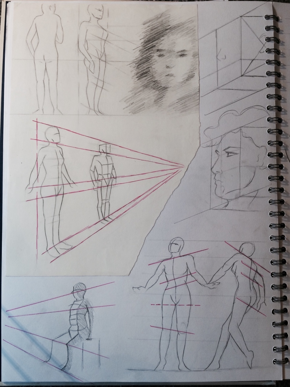
Along with our homework I was looking at adding the line of action. After drawing boxes and cubes for perspective I feel like my line work has gotten a bit stiff. I usually use curvy lines for the arms but never for the spine. I looked at a few examples to give me general idea of how to got about adding these.
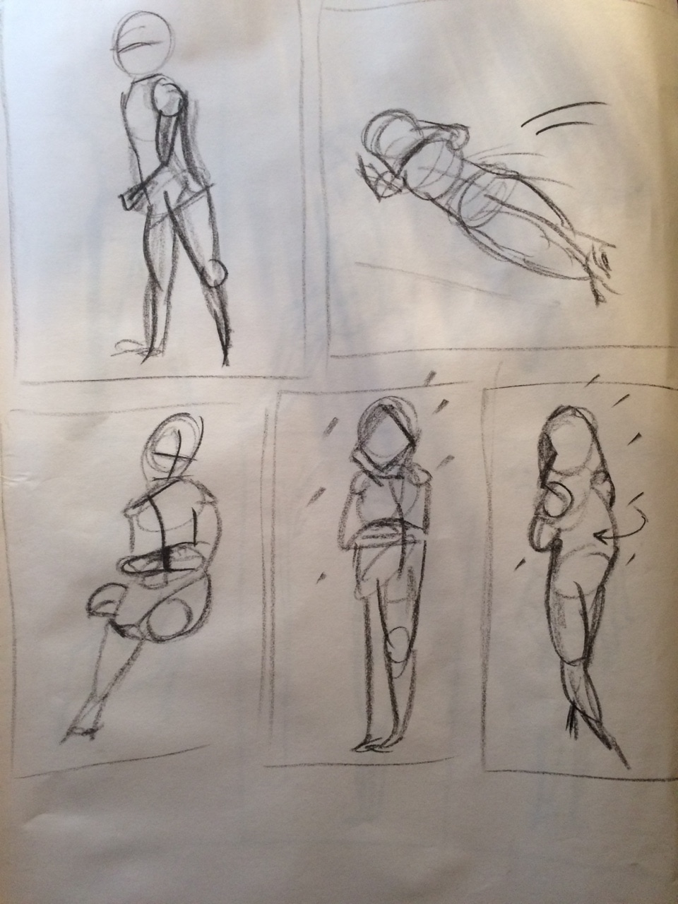
Drawings for practice below
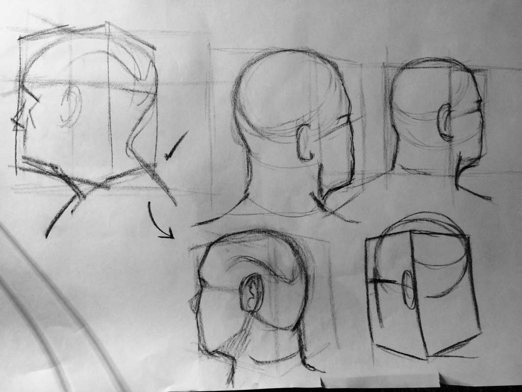
 Adding structure with tracing paper
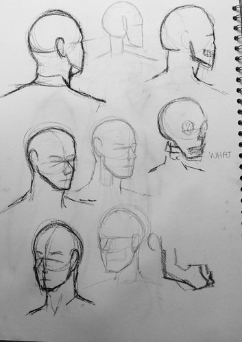
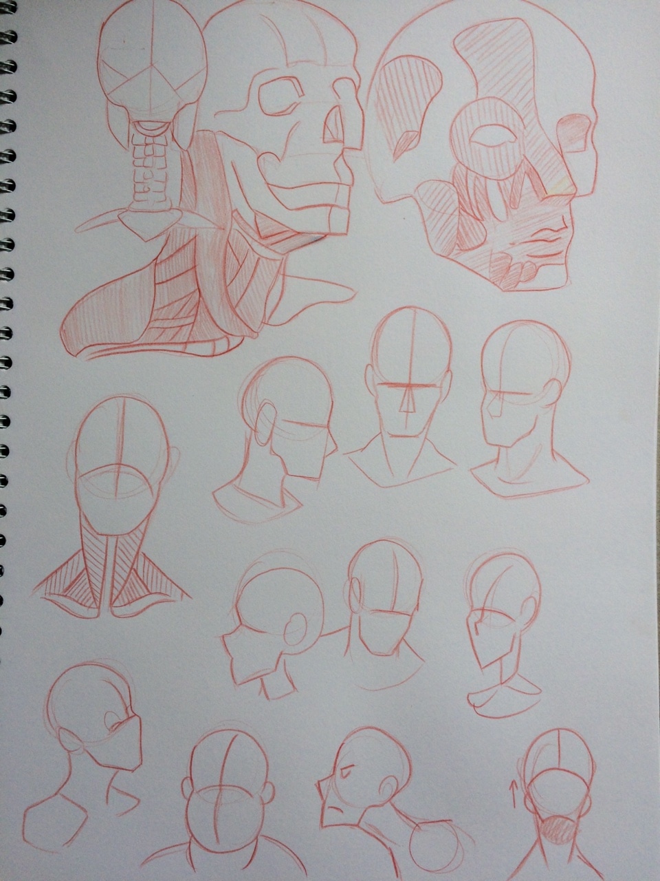
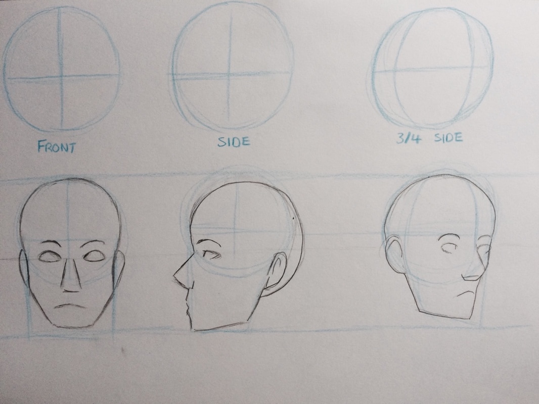
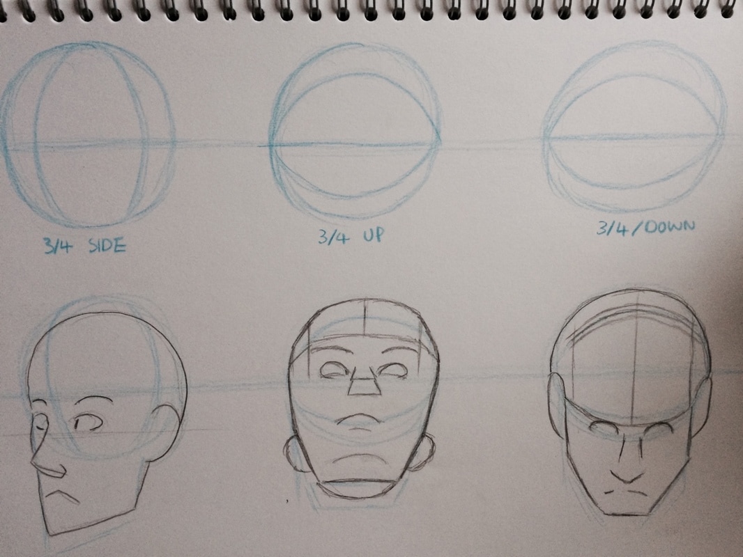
Above are the 1 minute studies from this week. From where I was standing they where all at angle so it was a good way for me to practice perspective using what I looked at from the homework I did last week. We then looked at doing head rotations- In the beginning I soon noticed how my perspective was off as I could seen under the models chin so I corrected my perspective which made the drawing look slightly better. This was the kind of process I used the entire time we were doing the studies. I would draw out what I thought it looked like first then fix it on the 2nd or 3rd attempt. I also asked Michael for some guidance for a few of the drawings as I knew it didn't look right but I didn't know what direction my perspective should be going.
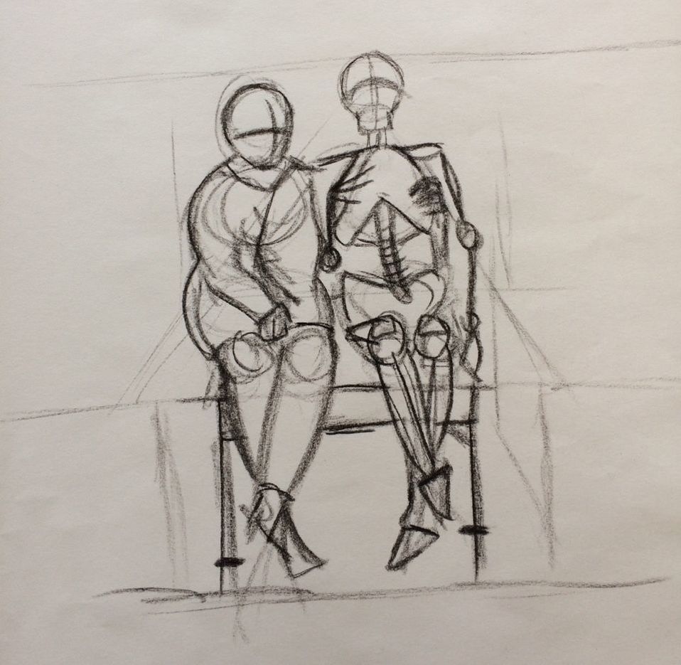
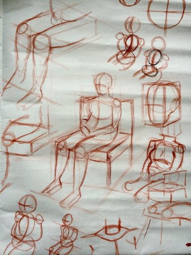
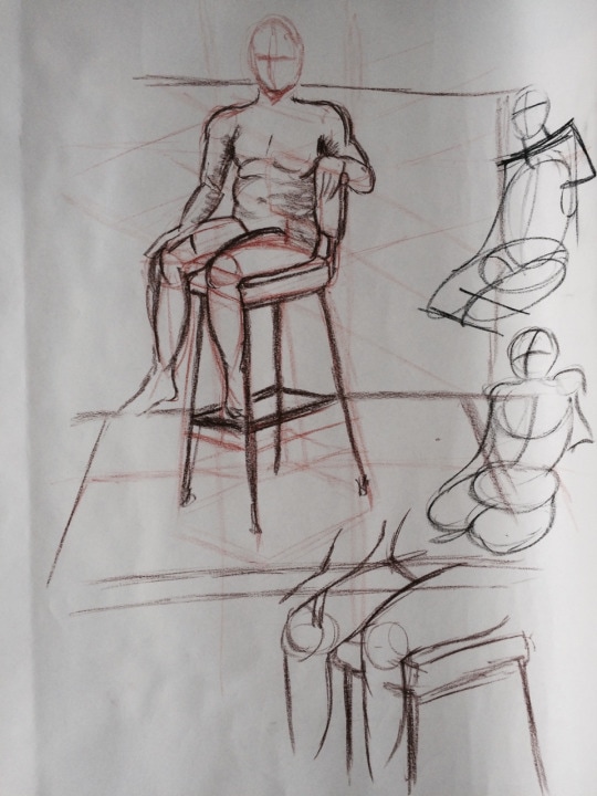
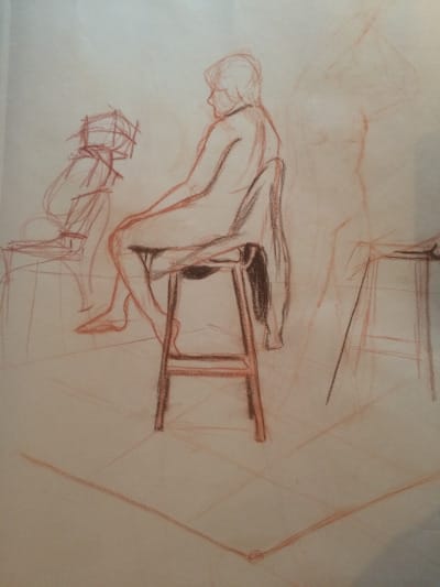
Little bit rusty starting back into life drawing. We are starting to look more at form by adding light and shading- in my 1 minute warm ups I tried to add little bits of shading in certain parts. We are also continuing with perspective, first by drawing the chair on it's own then with the model posing on top. I struggled getting the perspective of the model and scale right in my attempt- her head wasn't in the right position as well as her knees. Although Michael was able to show me roughly how the pose should be.
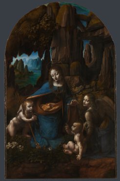
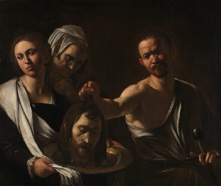
Our first assignment is to research and investigate drawing with Form and look up Chiaroscuro. From what I found chiaroscuro is the treatment of light and shade in drawing and painting- an effect of contrasted light and shadow. This is an Italian term which literally means 'light-dark'. In paintings the description refers to clear tonal contrasts which are often used to suggest the volume and modelling of the subjects depicted. Artists who are famed for the use of chiaroscuro include Leonardo da Vinci and Caravaggio. Leonardo employed it to give a vivid impression of the three-dimensionality of his figures, while Caravaggio used such contrasts for the sake of drama. Both artists were also aware of the emotional impact of these effects. (Source)
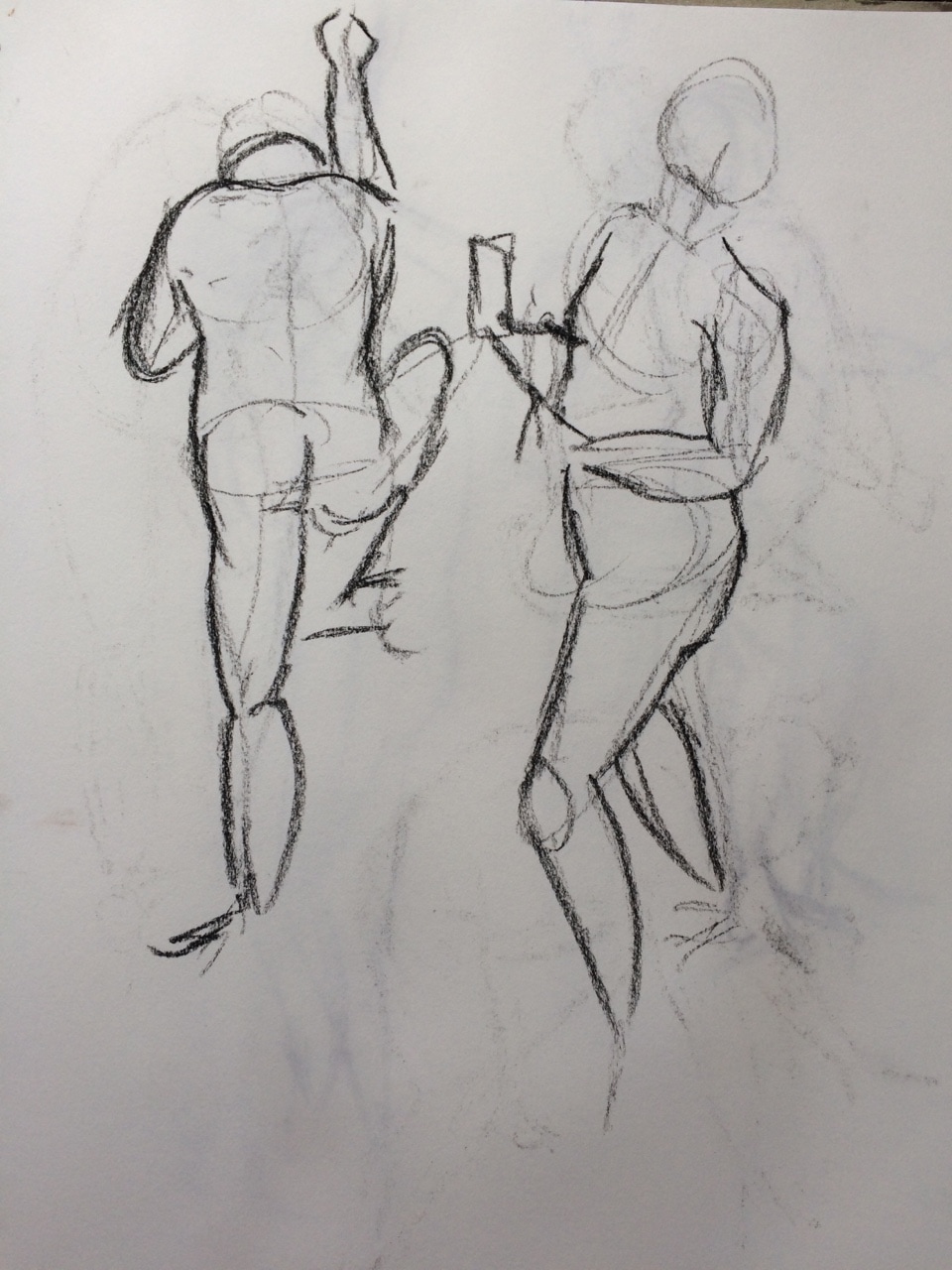
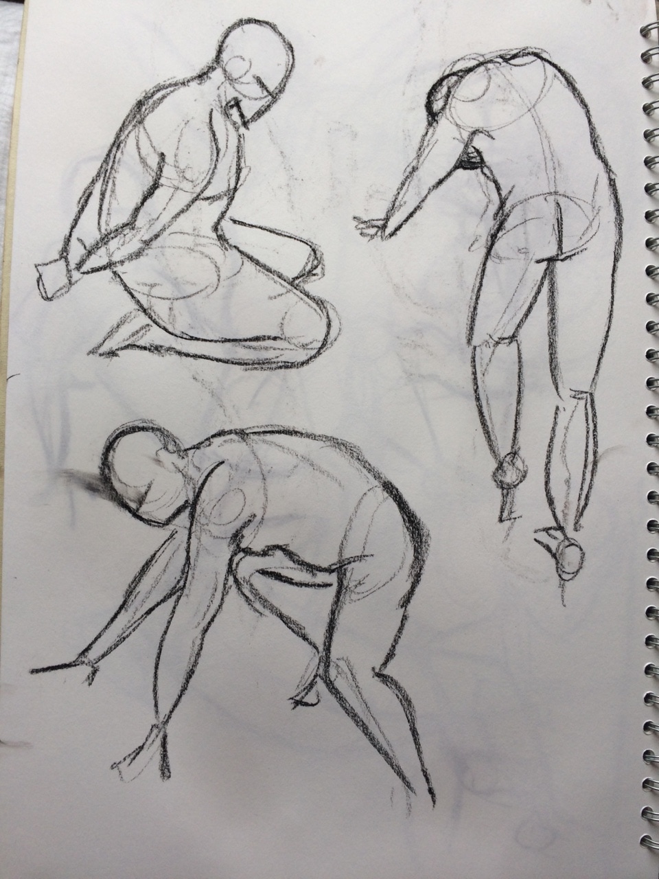
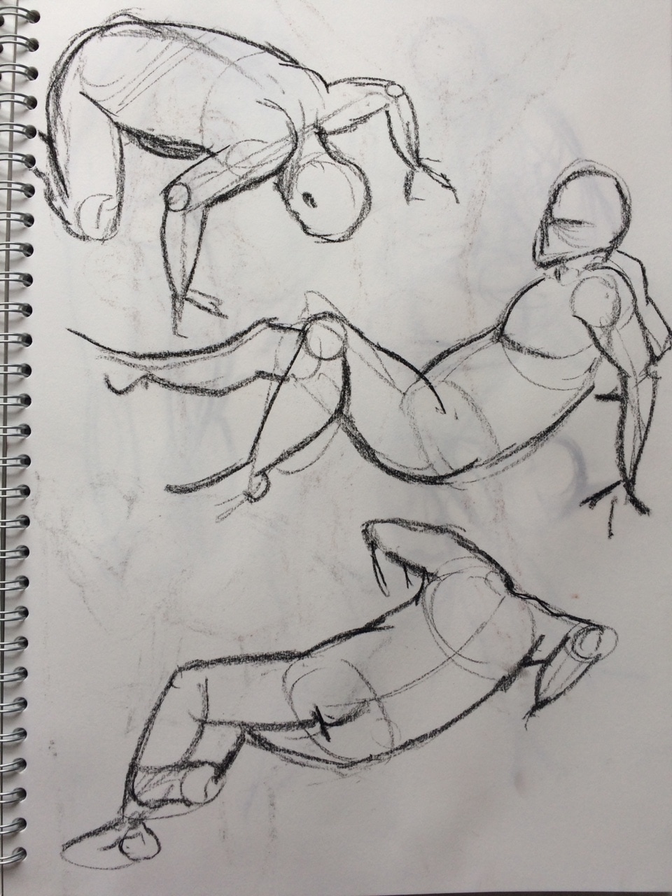
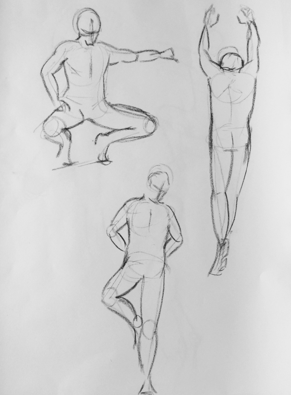
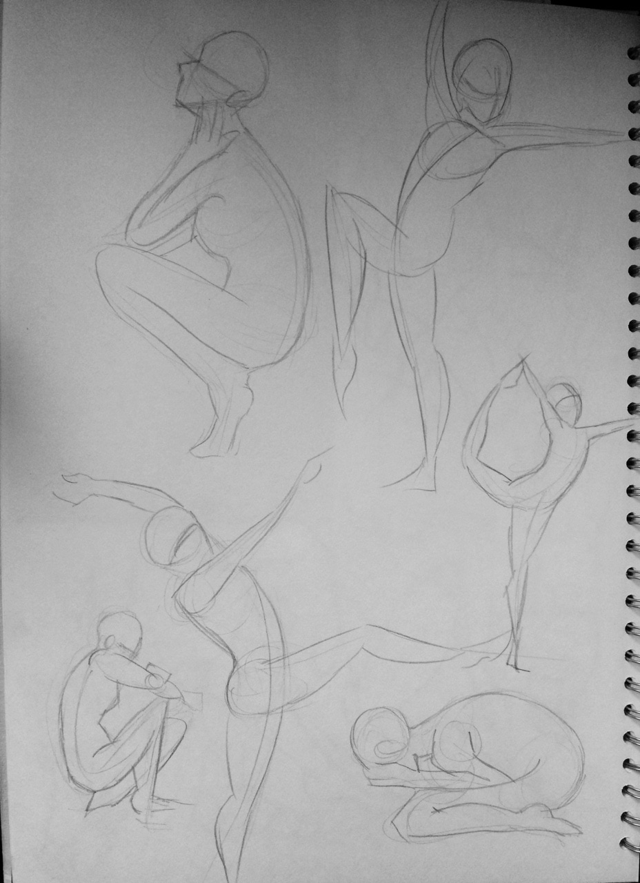
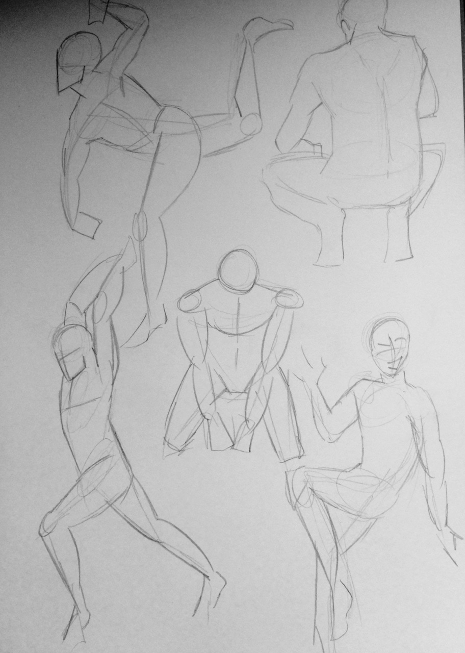
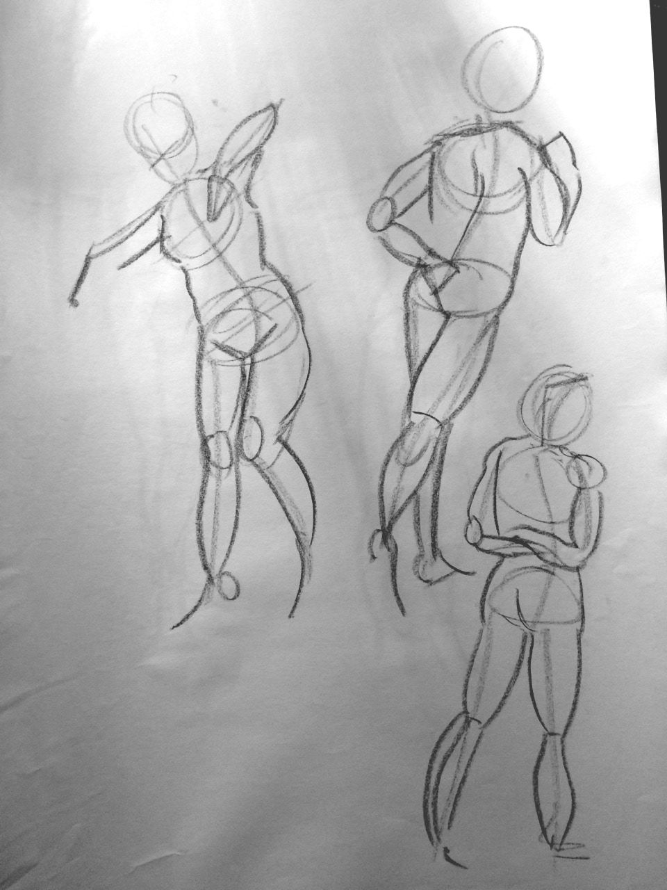
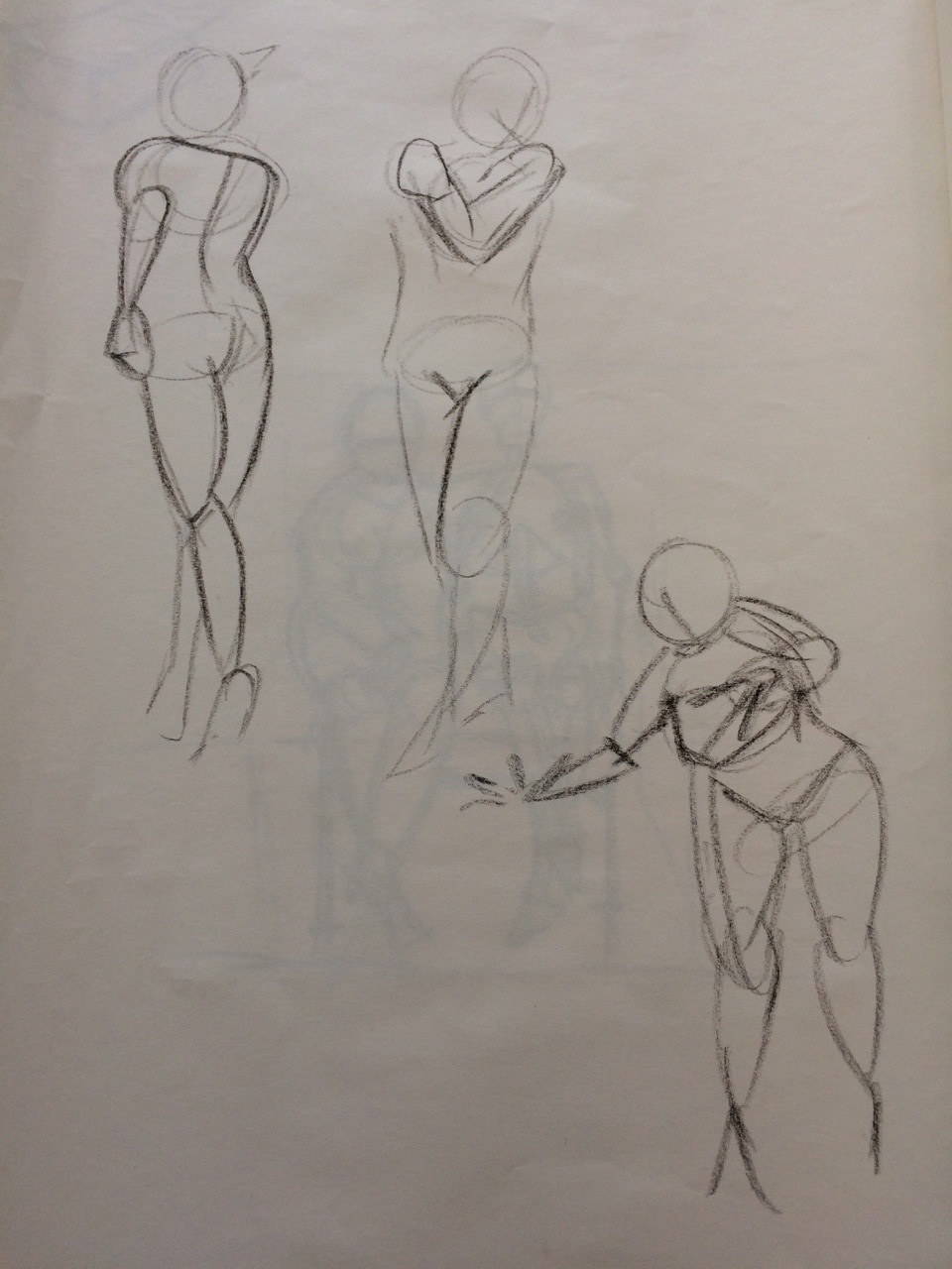
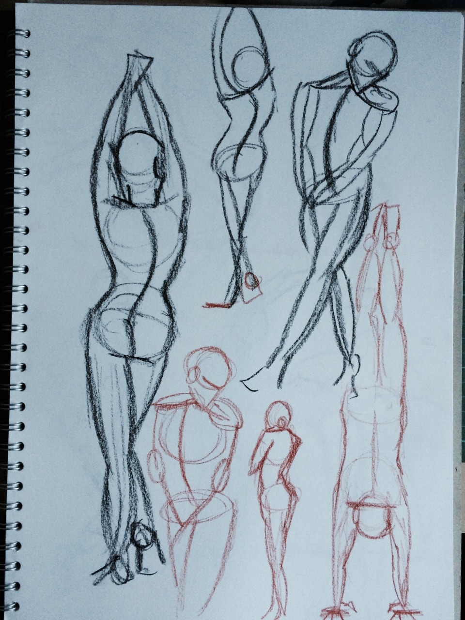
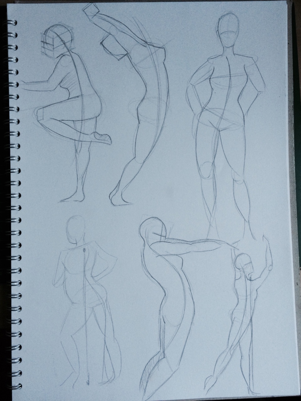
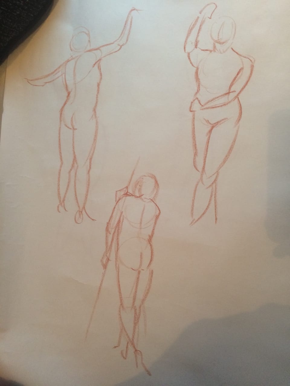
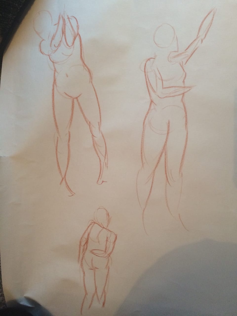
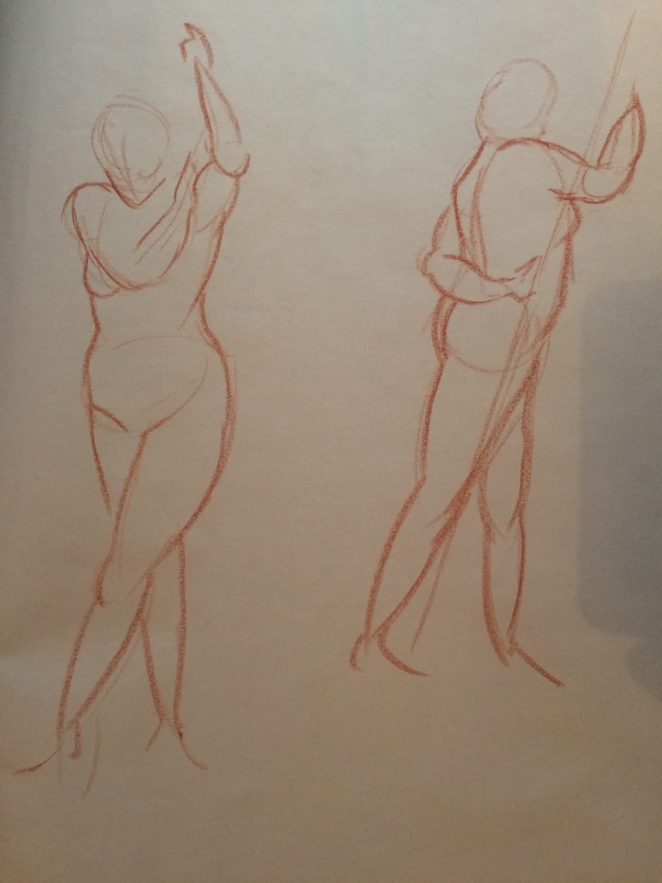
Practising with poses and perspective
|
|
 RSS Feed
